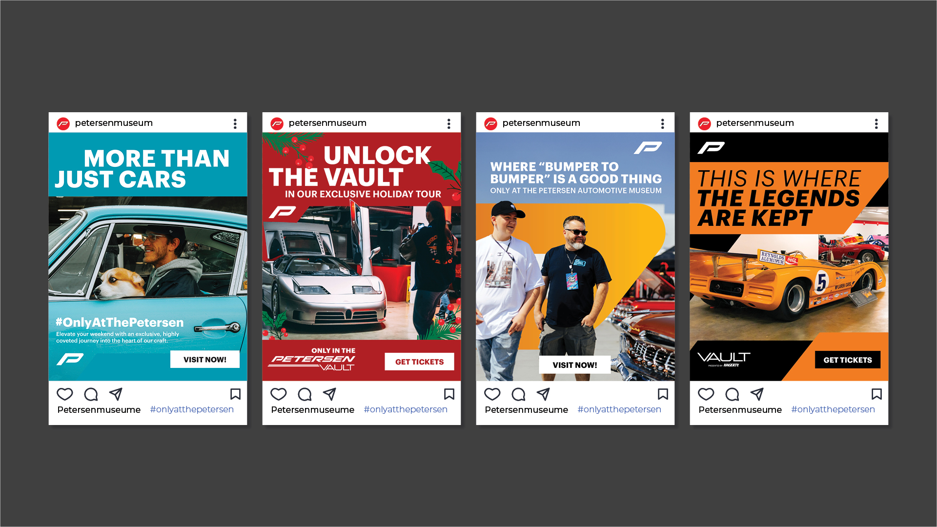
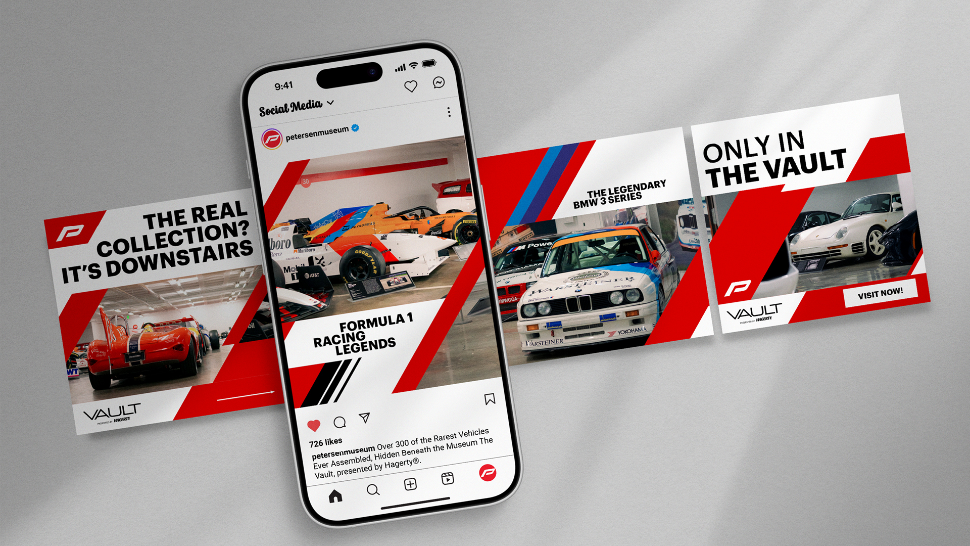

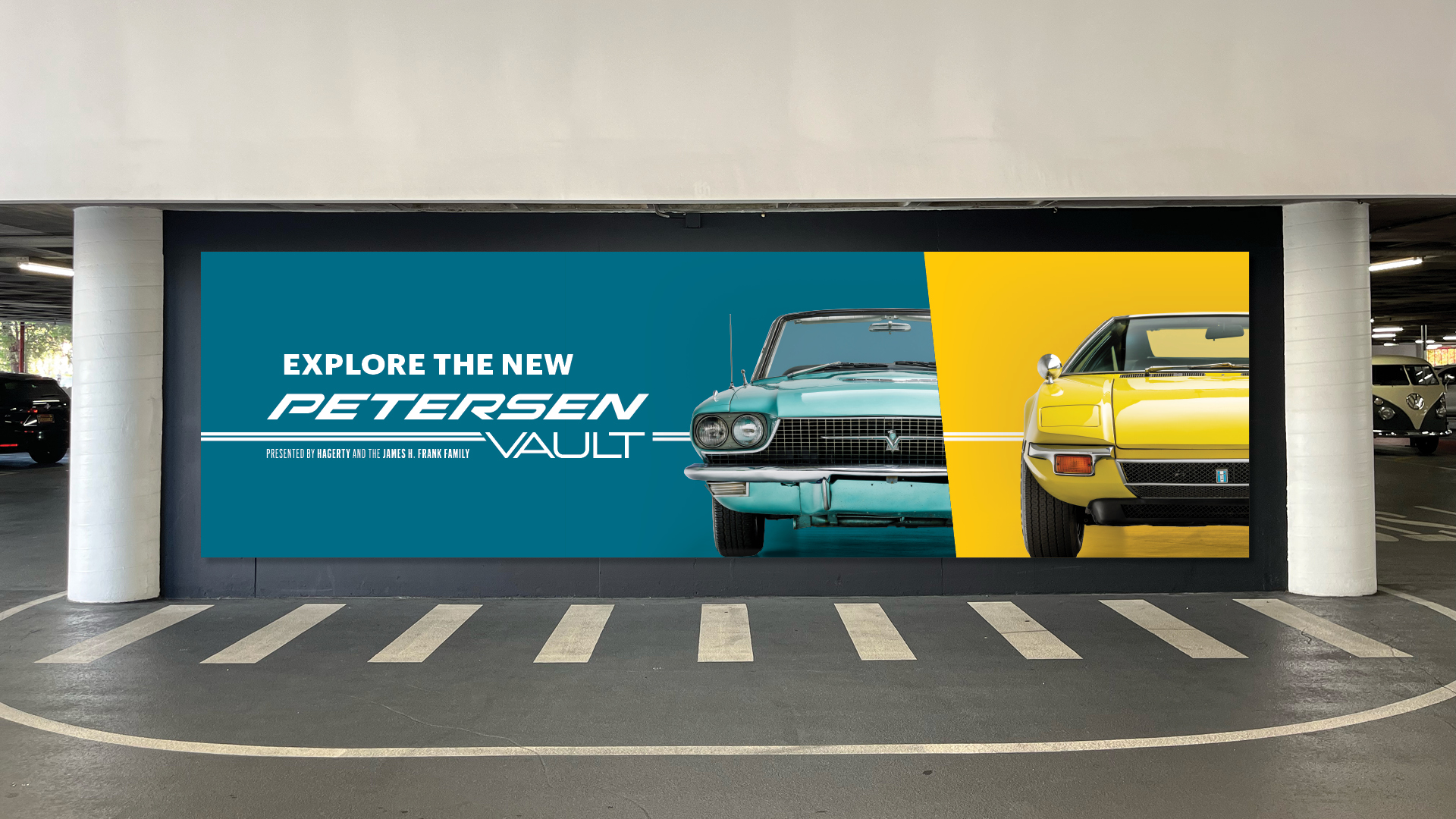
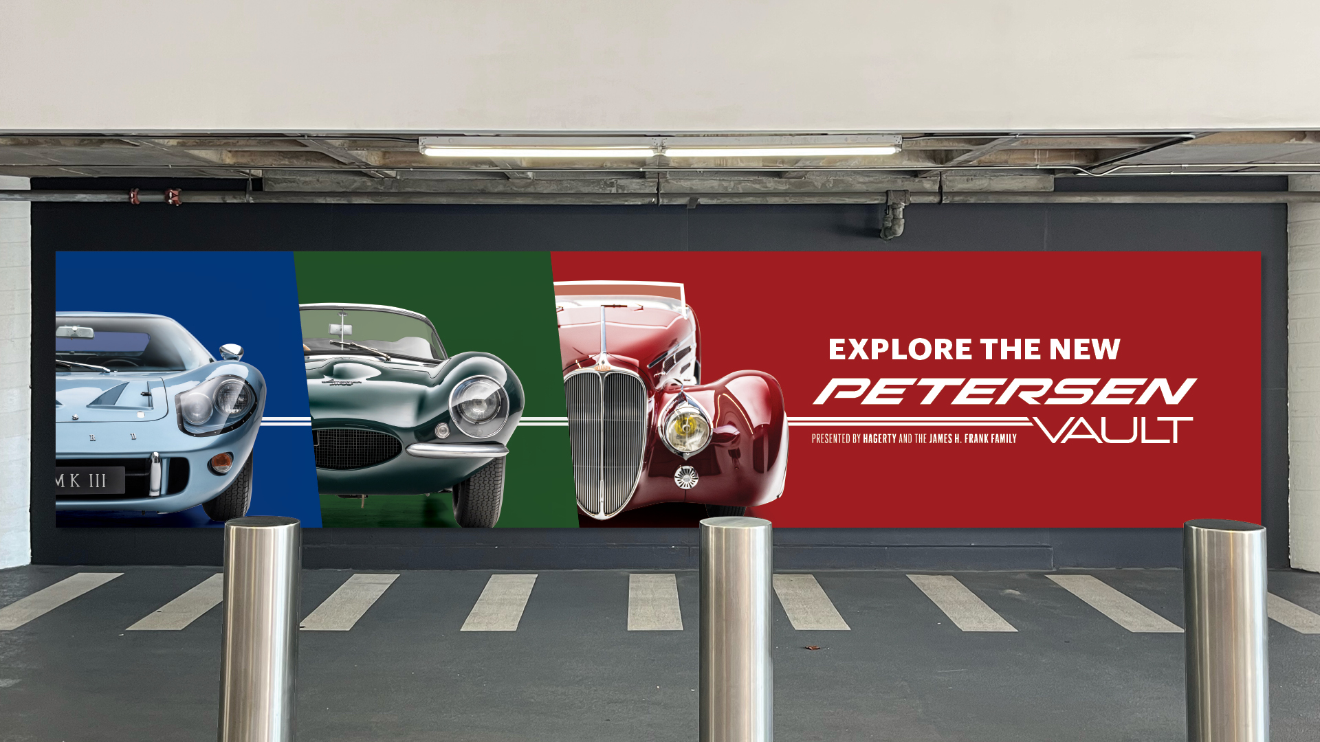
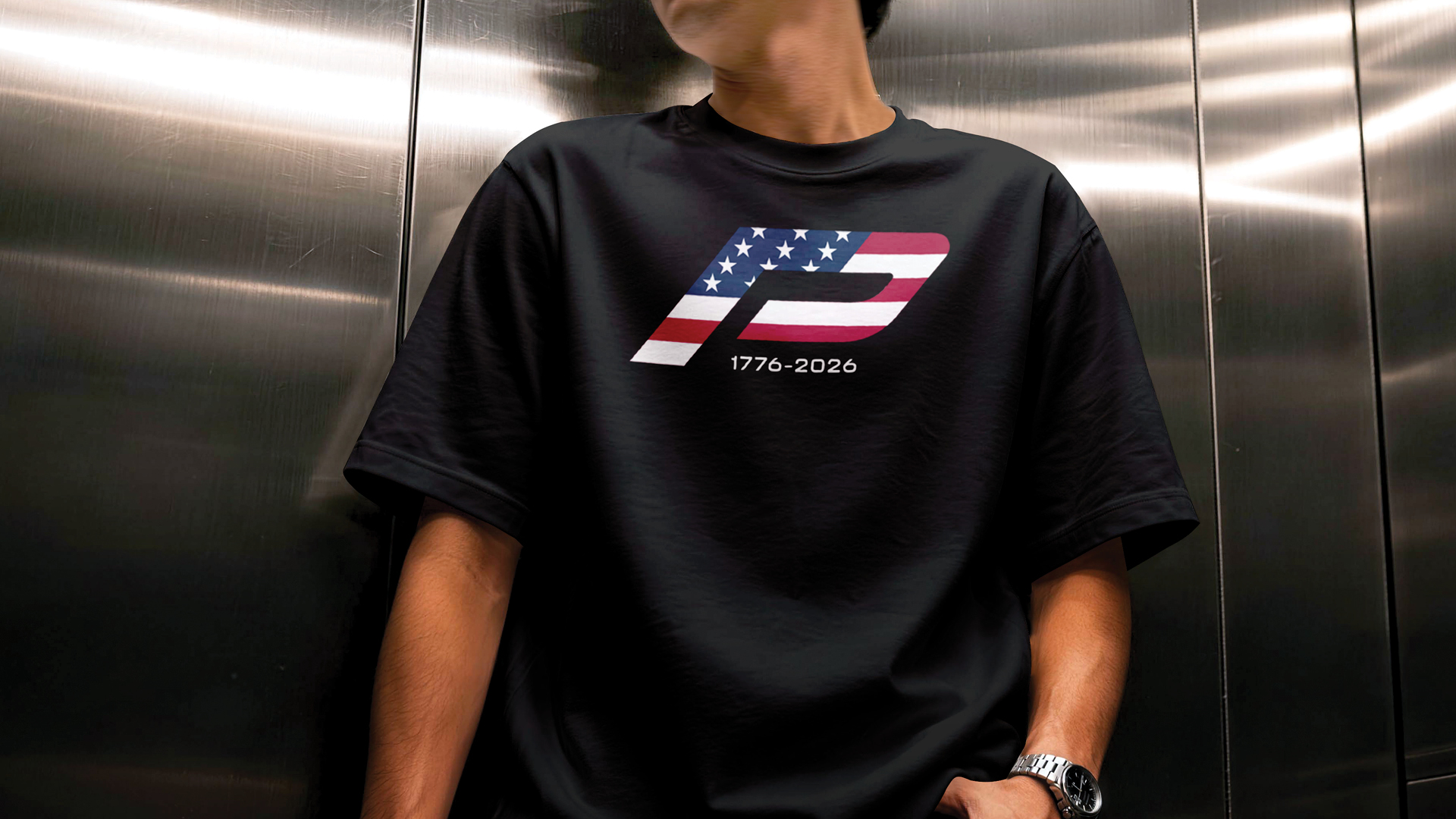
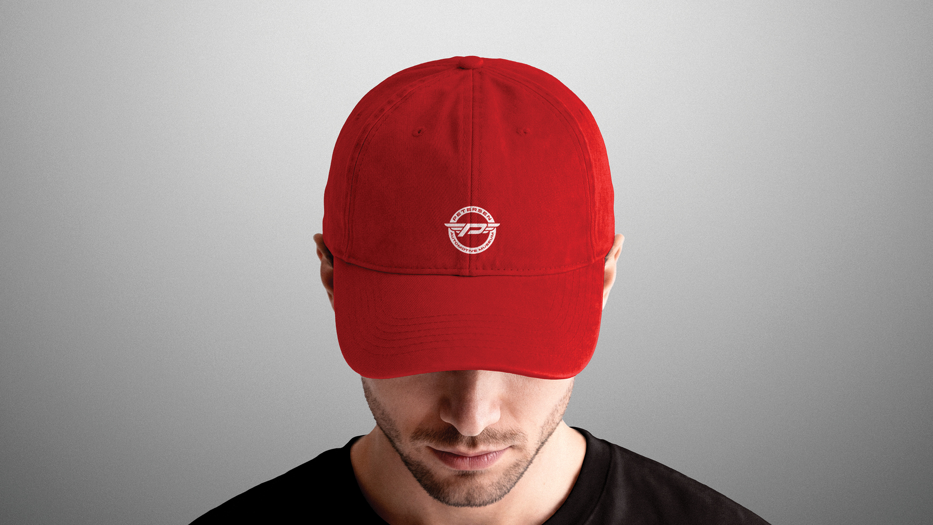
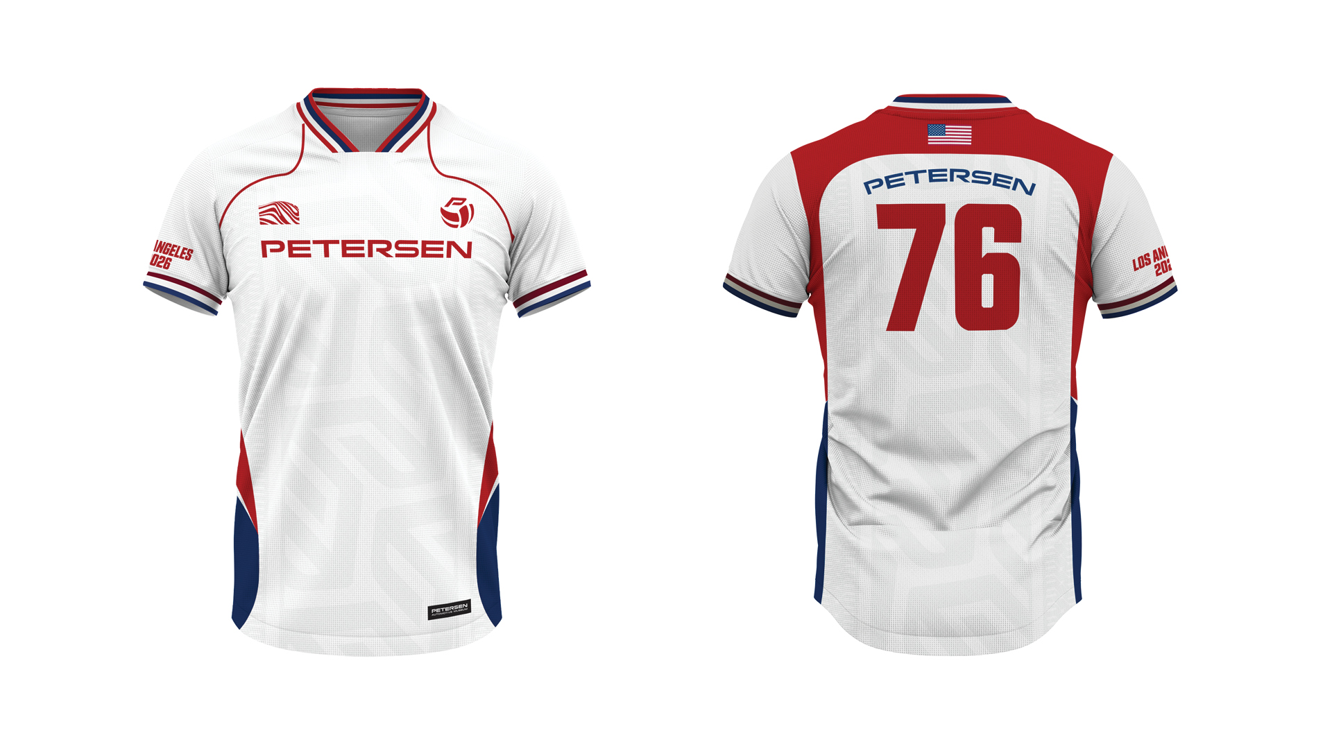
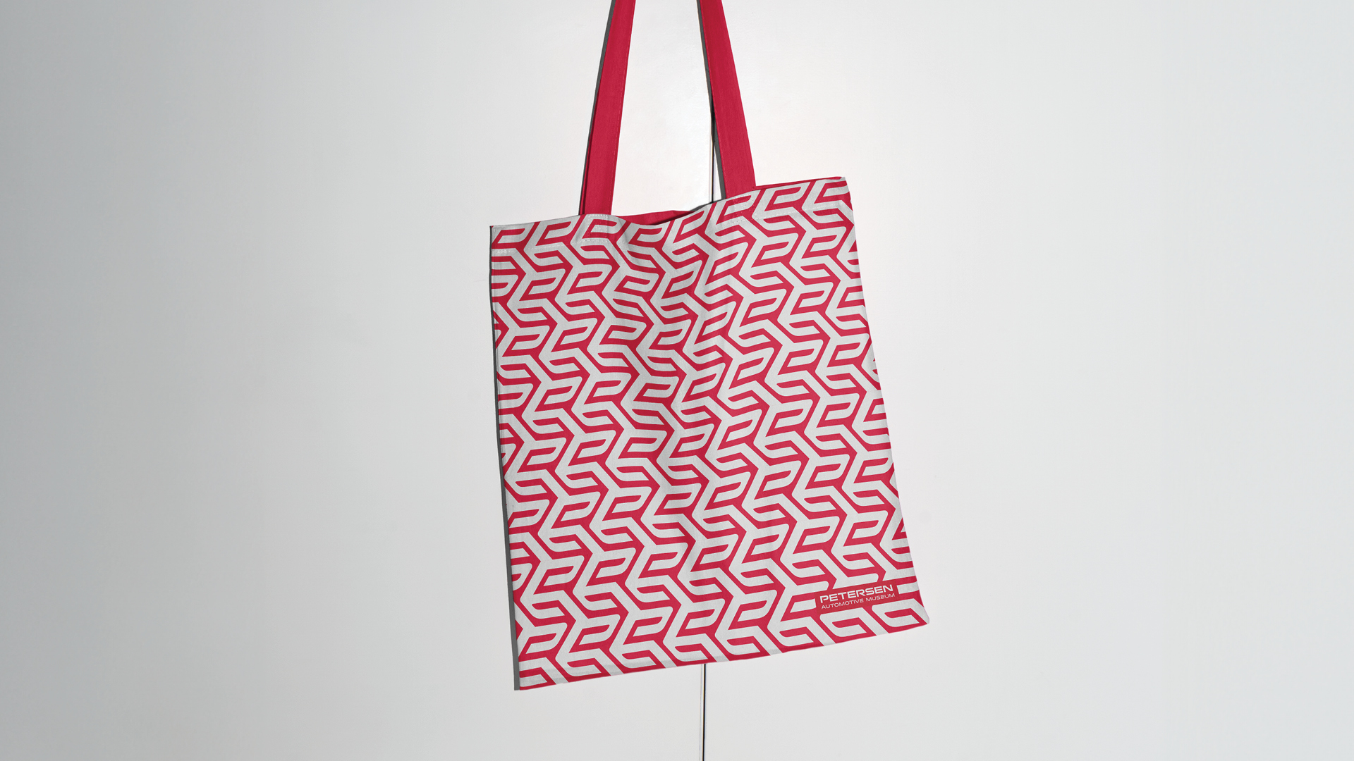
The P uses the same typeface as Petersen’s original logo, with an italic angle added as a reference to the form and movement of a car spoiler. This creates a distinctive visual identity and a sense of motion, reflecting the continuous evolution of automotive history that Petersen documents and preserves.
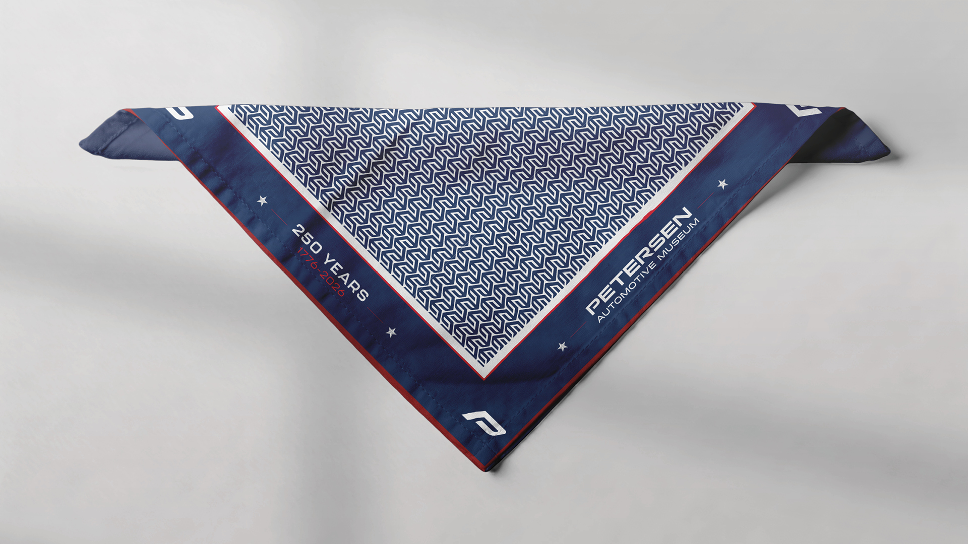
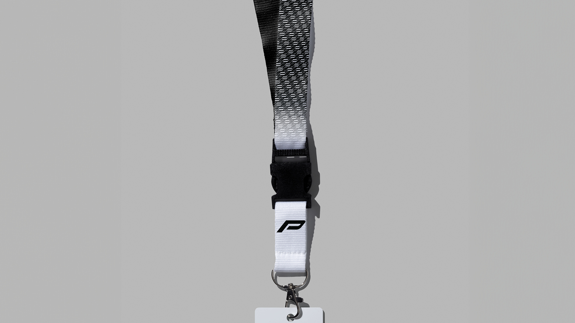
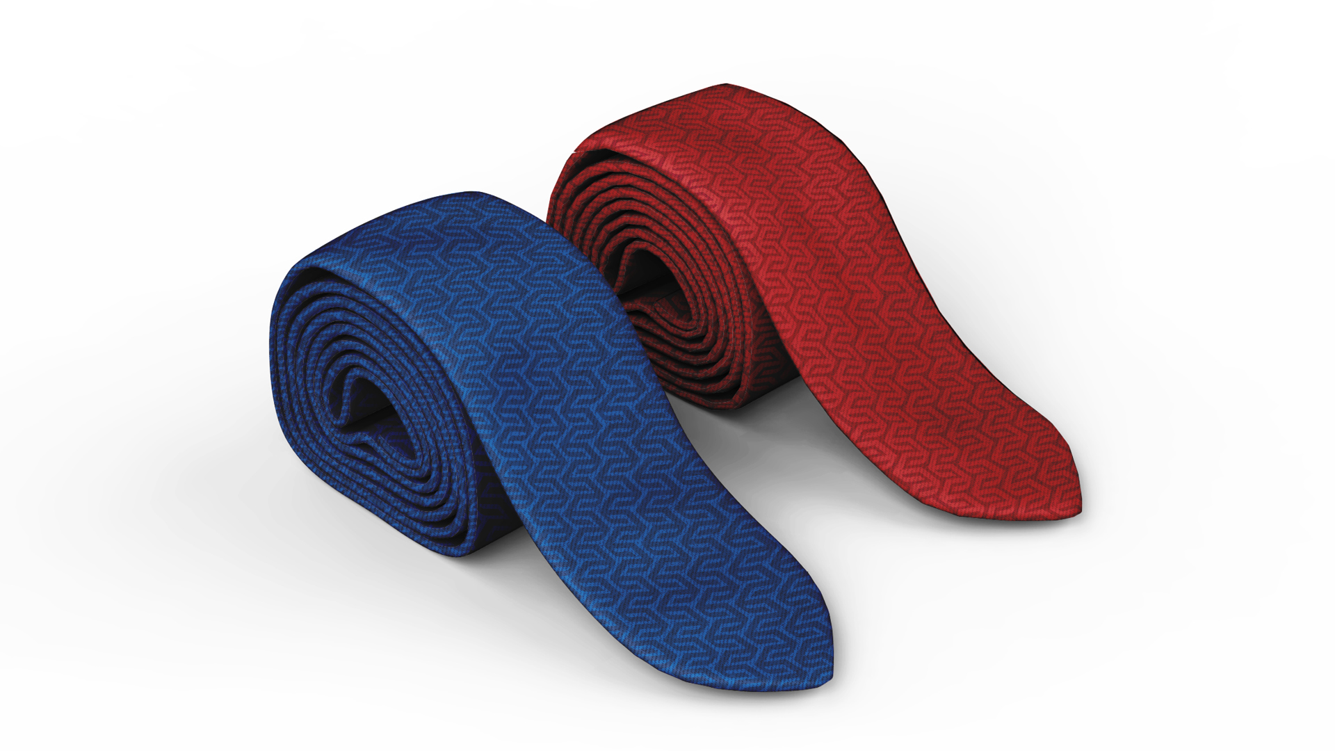
A series of patterns was created from the P form, with each pattern inspired by different parts of the automobile.
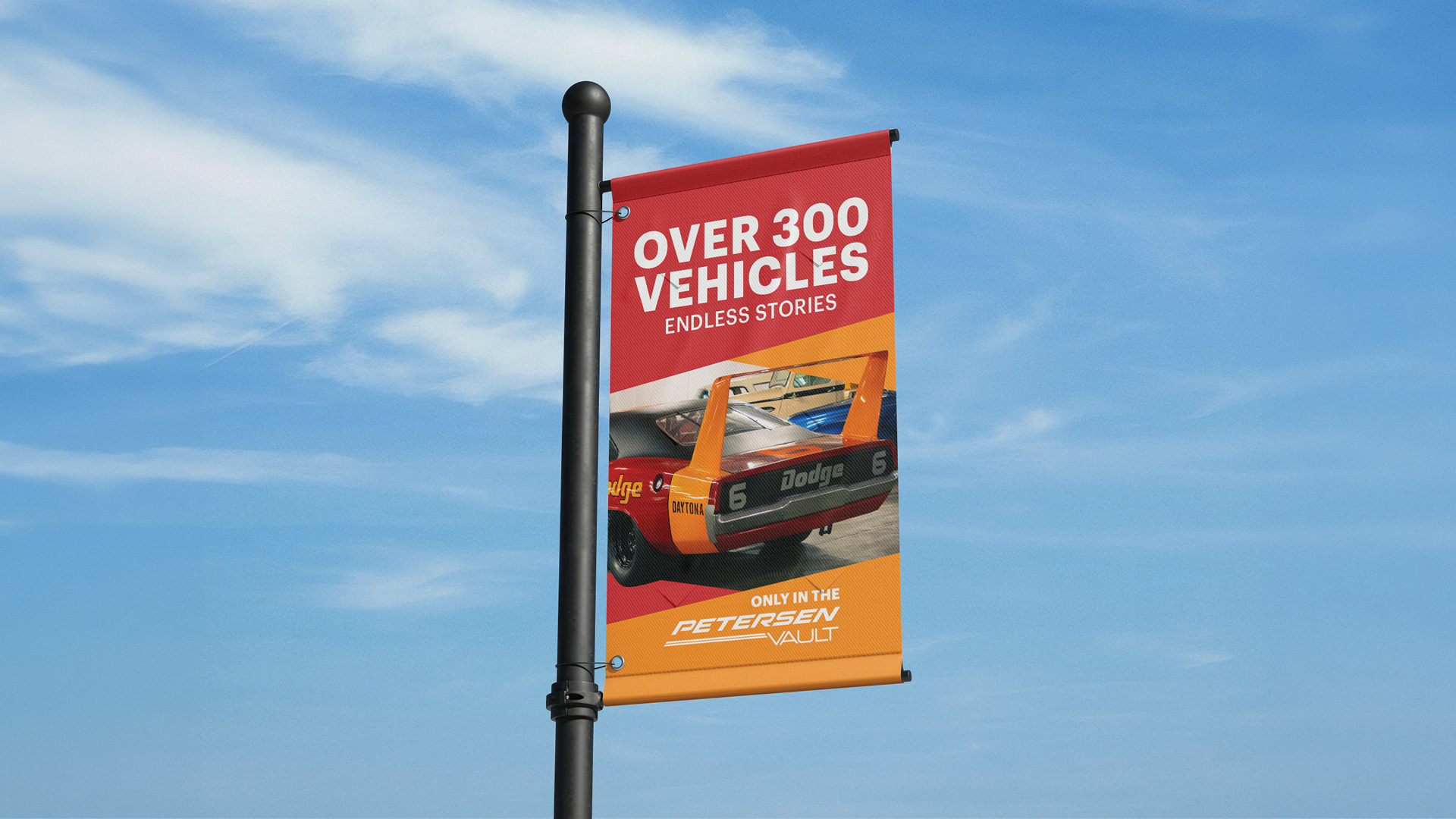
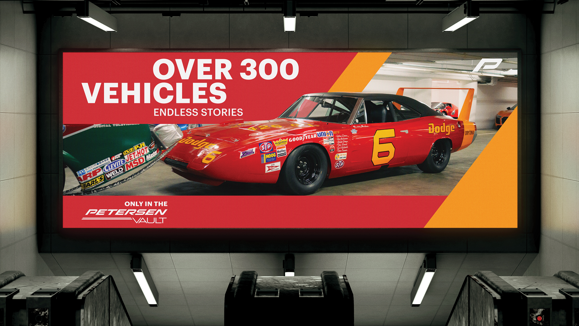
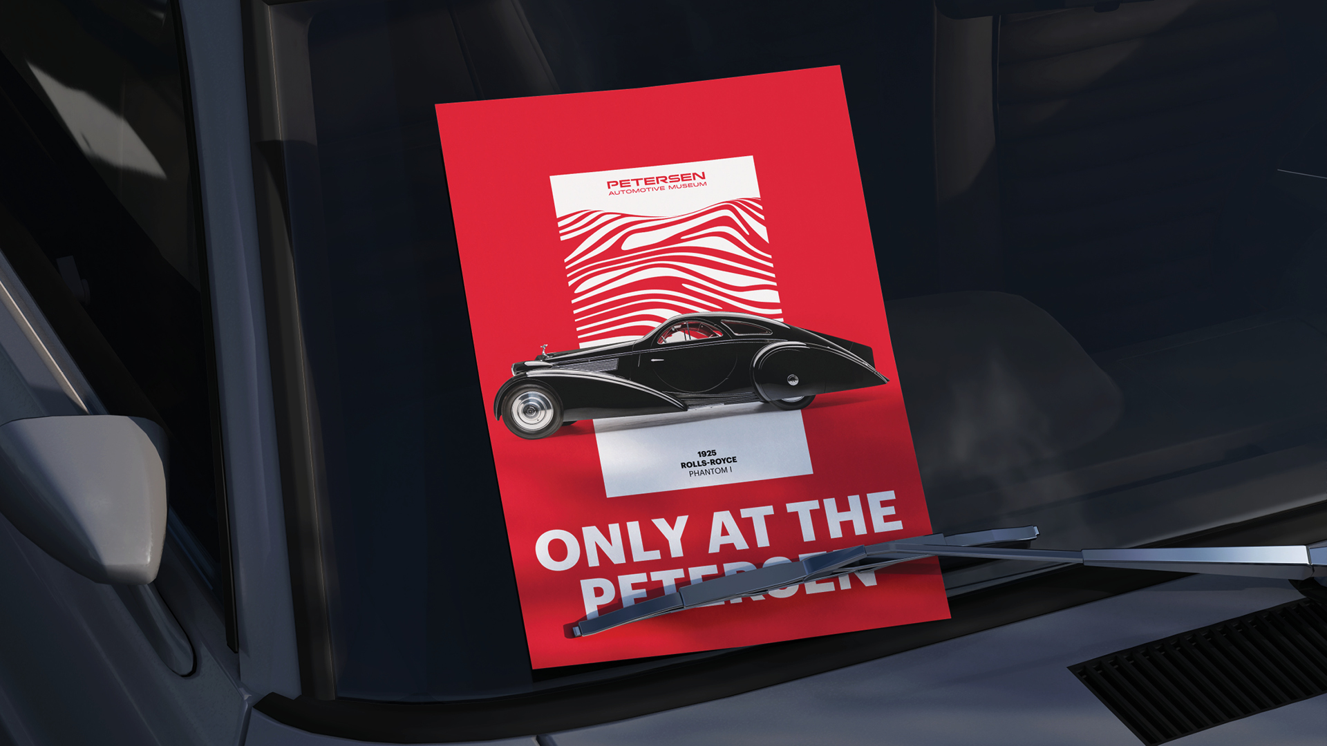
The P patterns and the P shape are used extensively across different media, creating a flexible and cohesive visual language throughout the brand.
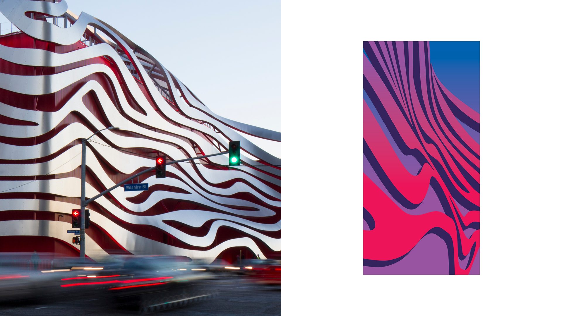
The design team also created a ribbon graphic, inspired by the signature ribbon architecture of the Petersen Automotive Museum.

Design Director: Benjamin de-Campos
Designer: Blake Vasquez, Nathan Evans, Shengjie Wu
Marketing Manager: Marly Moultrie
Marketing Team: Emerson Harris, Jonathan Lucero
© 2026 Shengjie Wu. All Rights Reserved.
