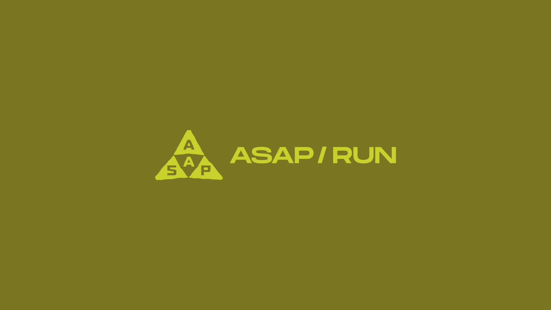



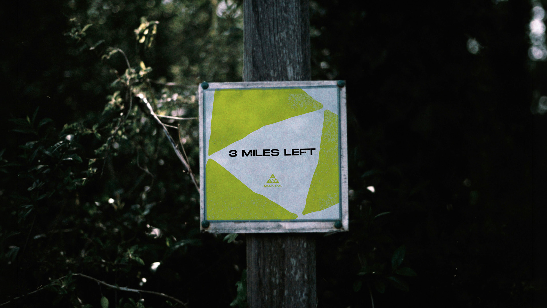
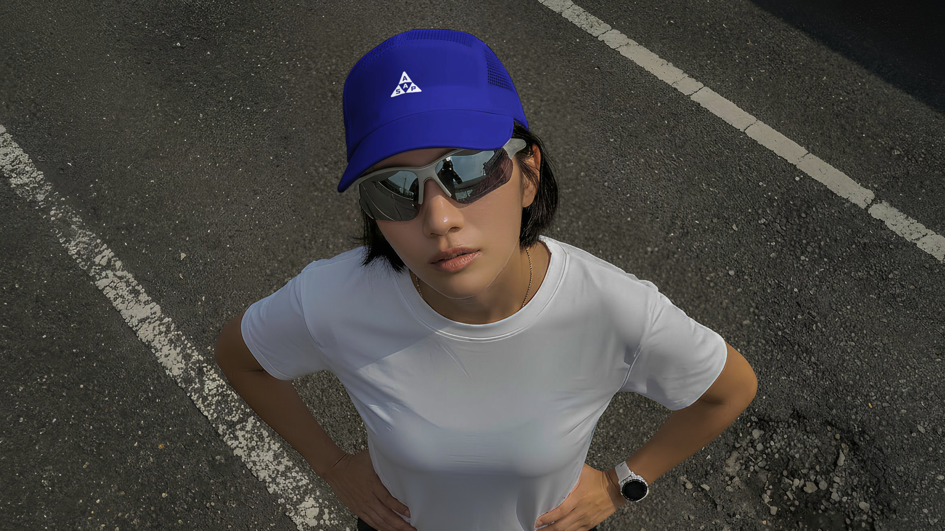
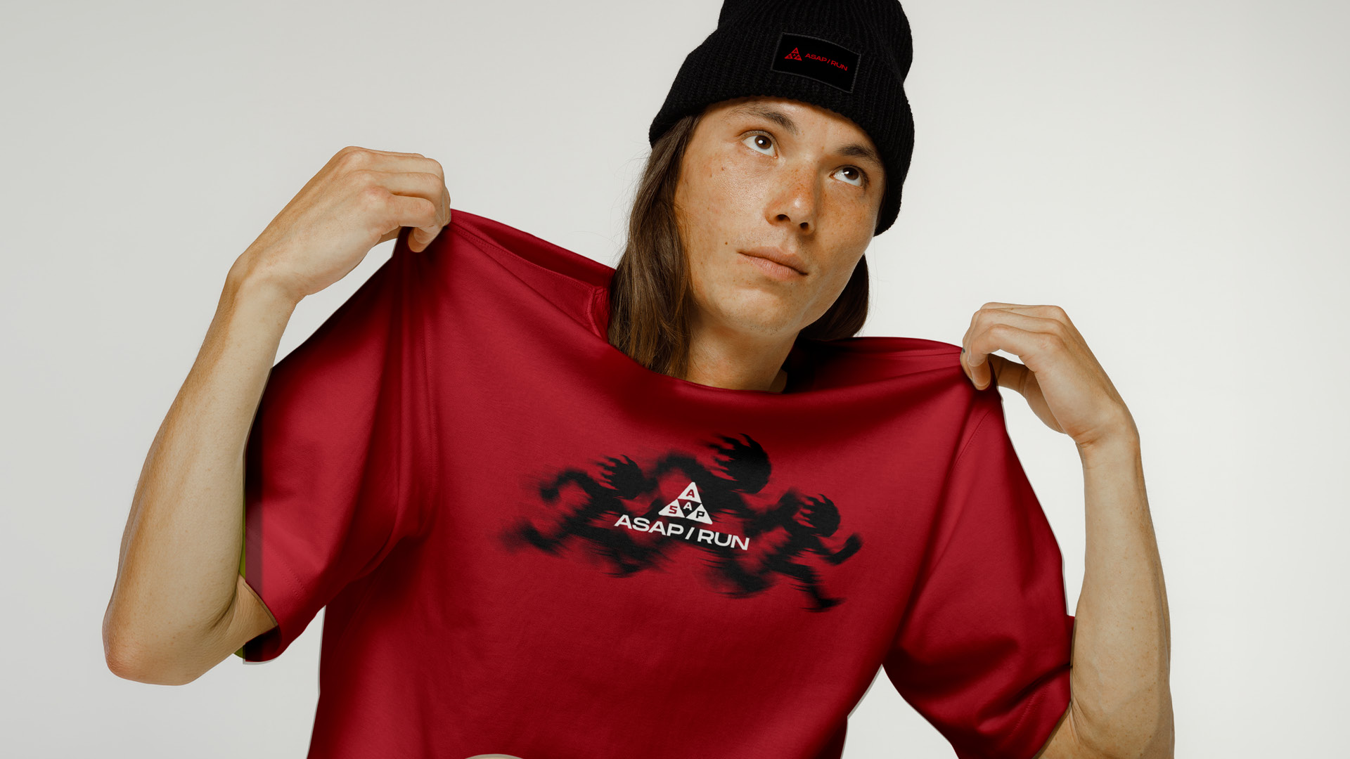
The logo is inspired by a kaleidoscope formed by three triangles, representing the three dimensions of ASAP: healing, connection, and movement.
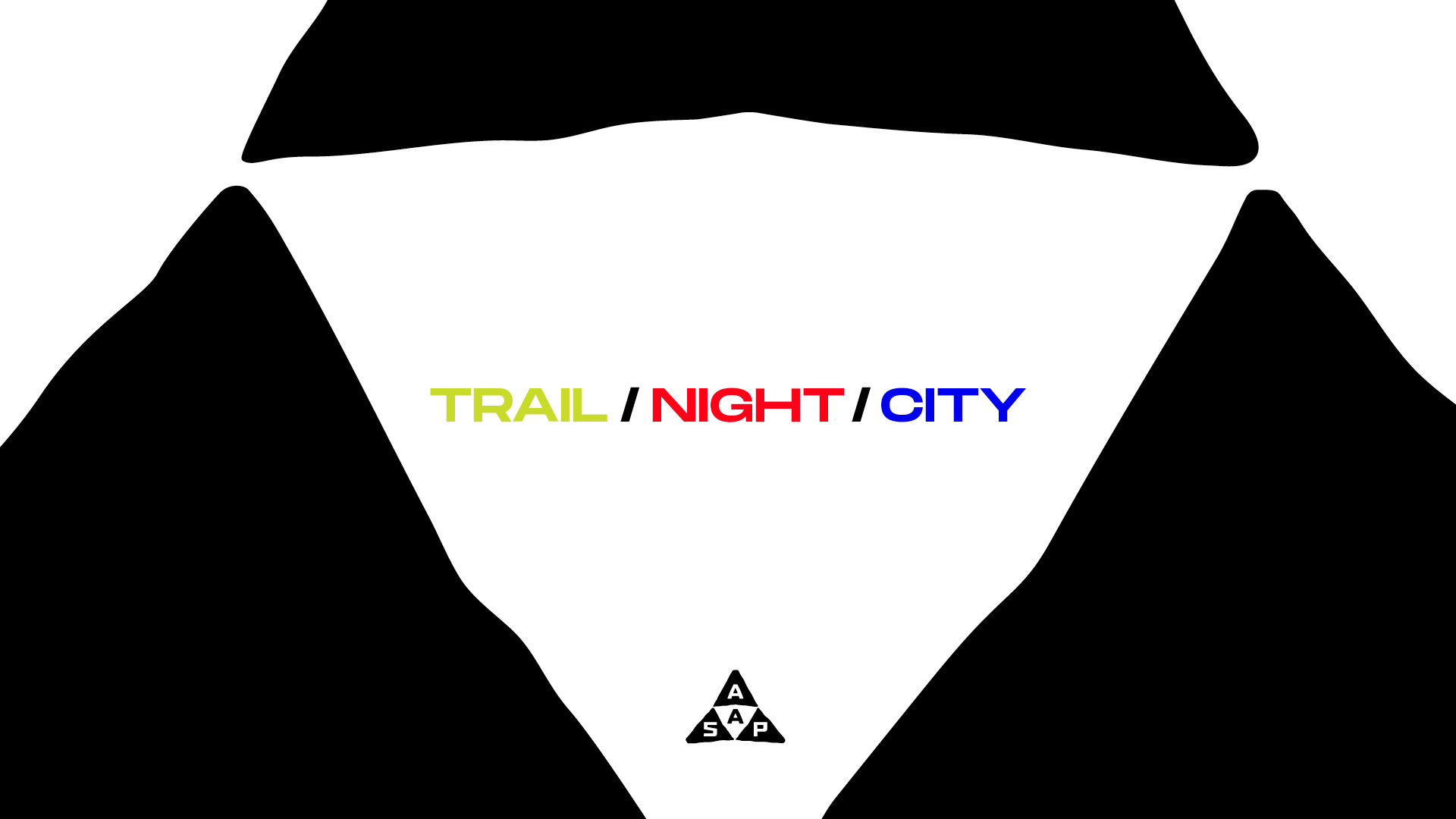
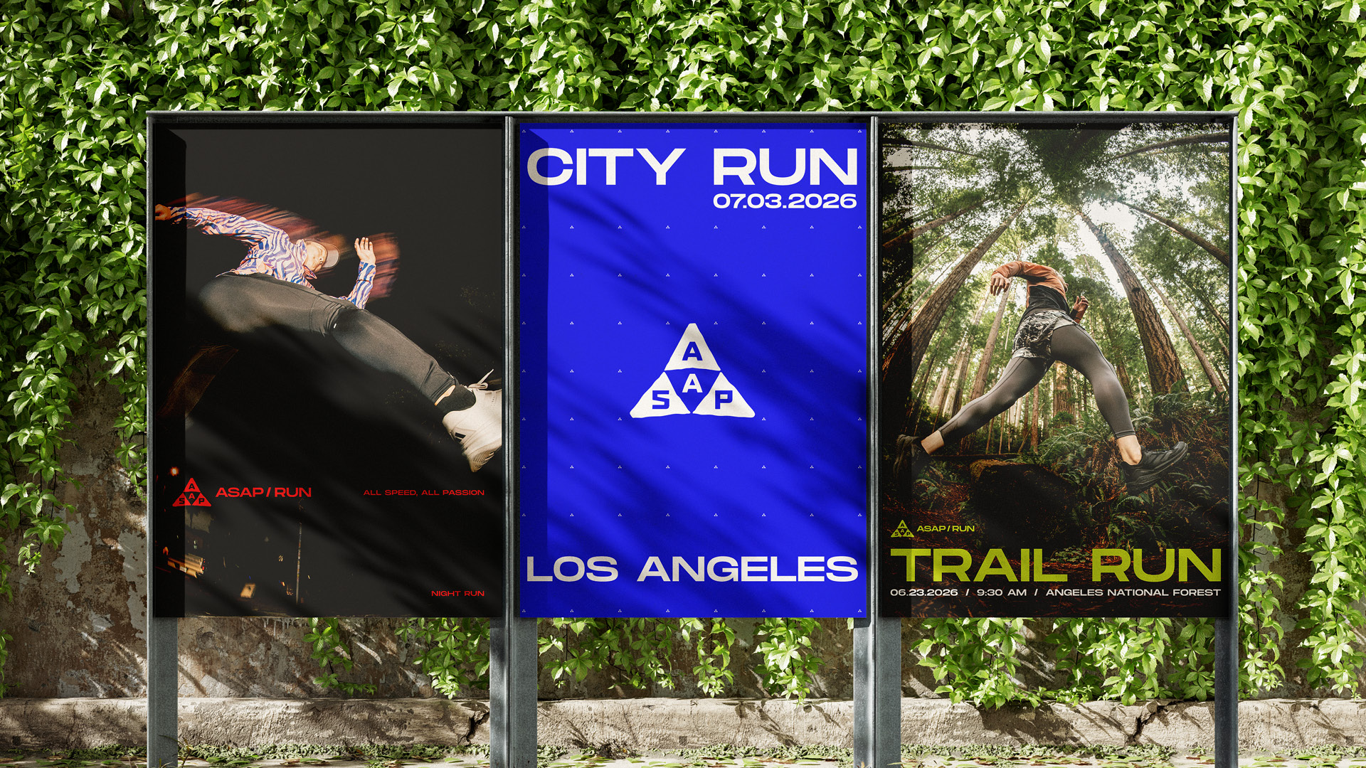
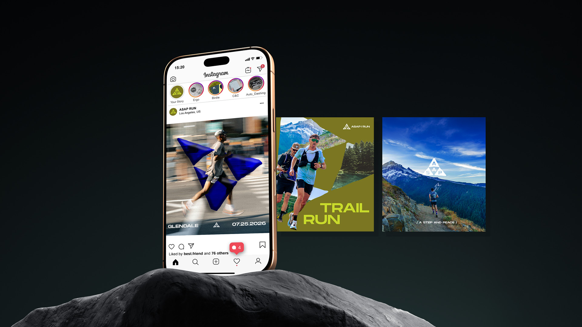
It also represents the club's strong sense of community and its three running experiences: trail, city, and night runs.
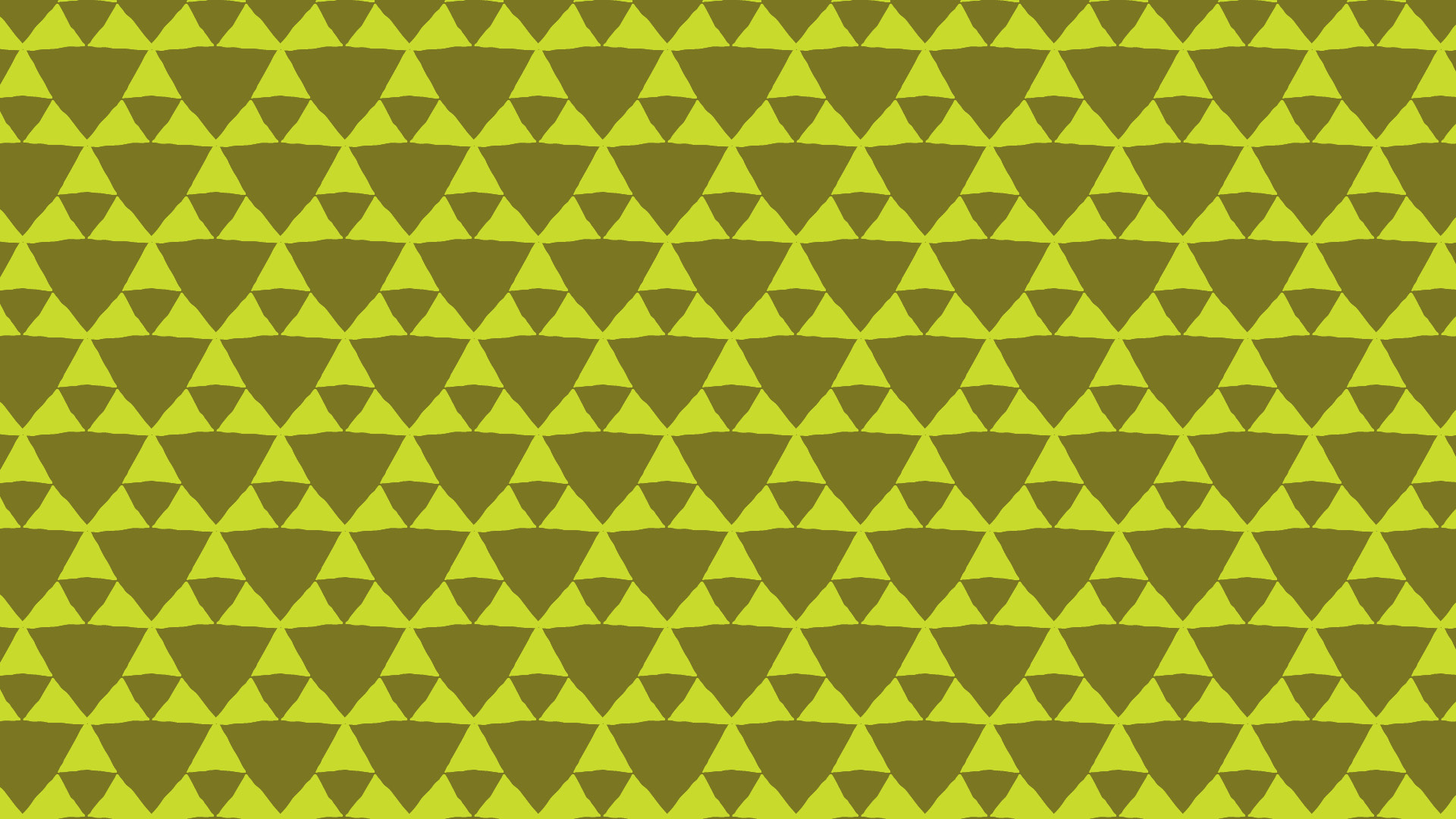
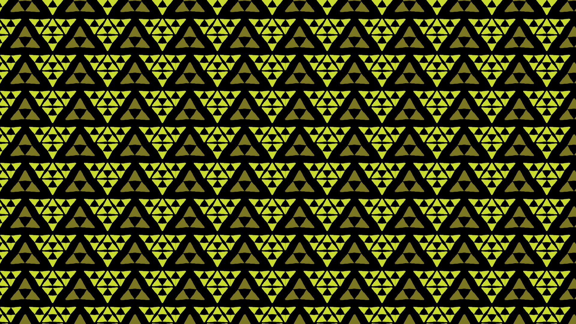
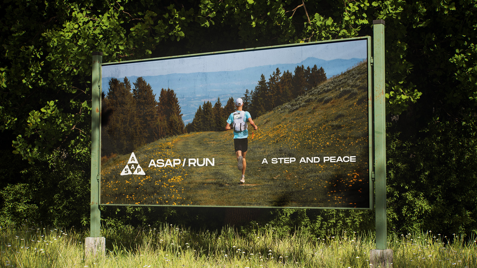
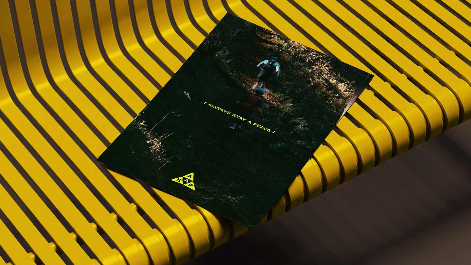
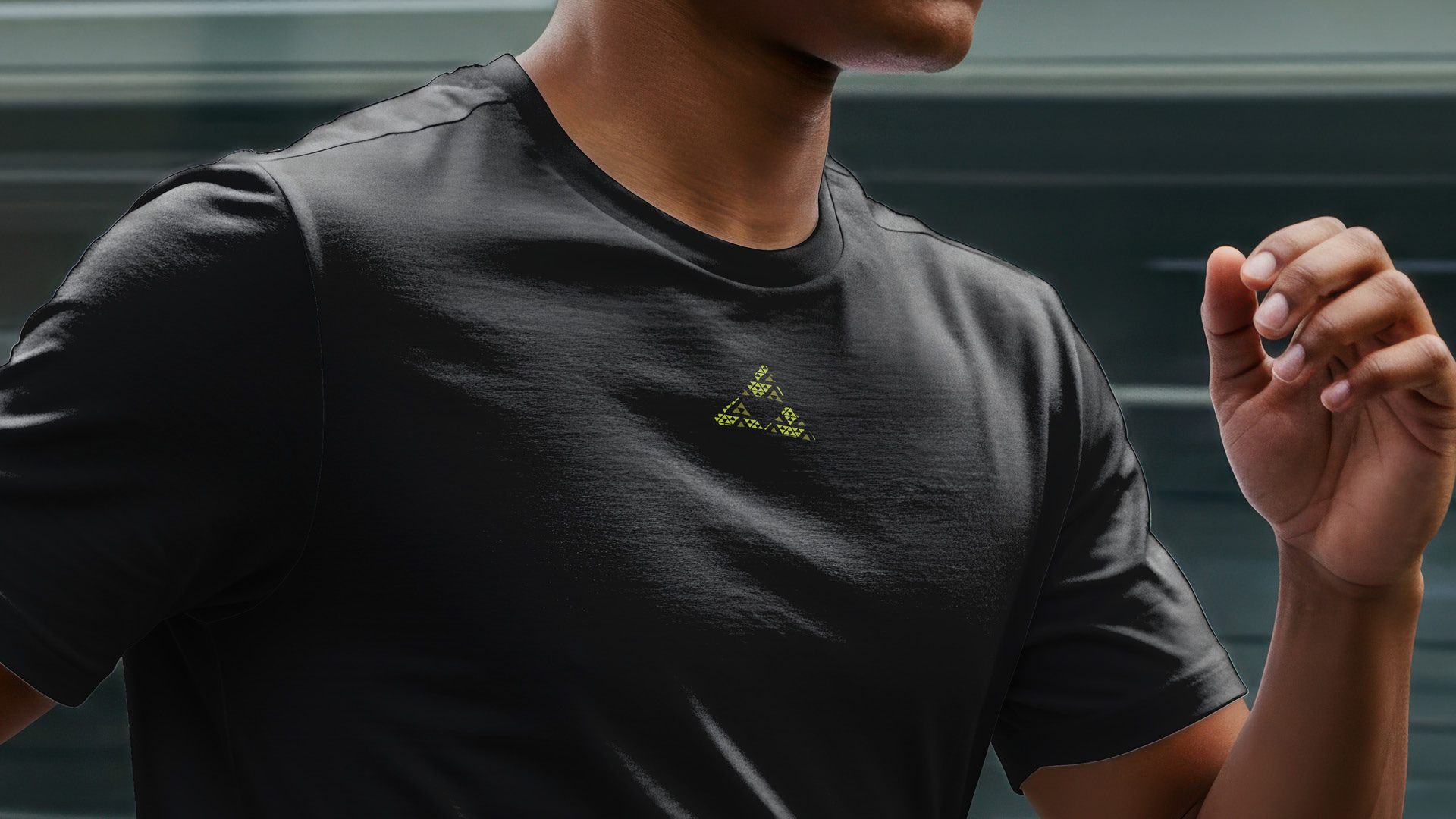
The logo expands into a dynamic pattern system, with each variation paired with a unique color palette to represent the different vibes of trail, city, and night runs. Inspired by natural landscapes, urban environments, and nighttime atmospheres, the system creates distinct identities while preserving a unified visual language.



Creative Director: Shengjie Wu
Art Director: Yaheng Li
Designer: Yaheng Li, Shengjie Wu
© 2026 Shengjie Wu. All Rights Reserved.
