
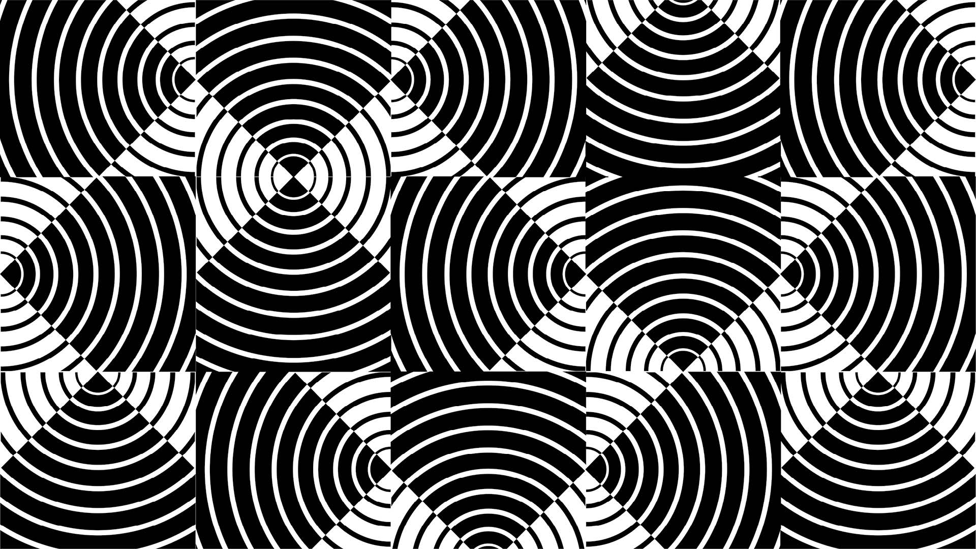
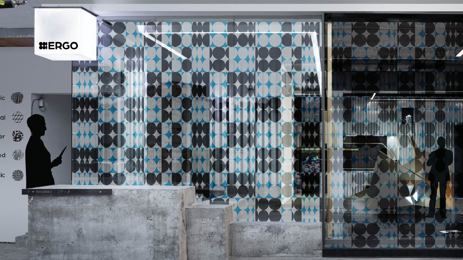
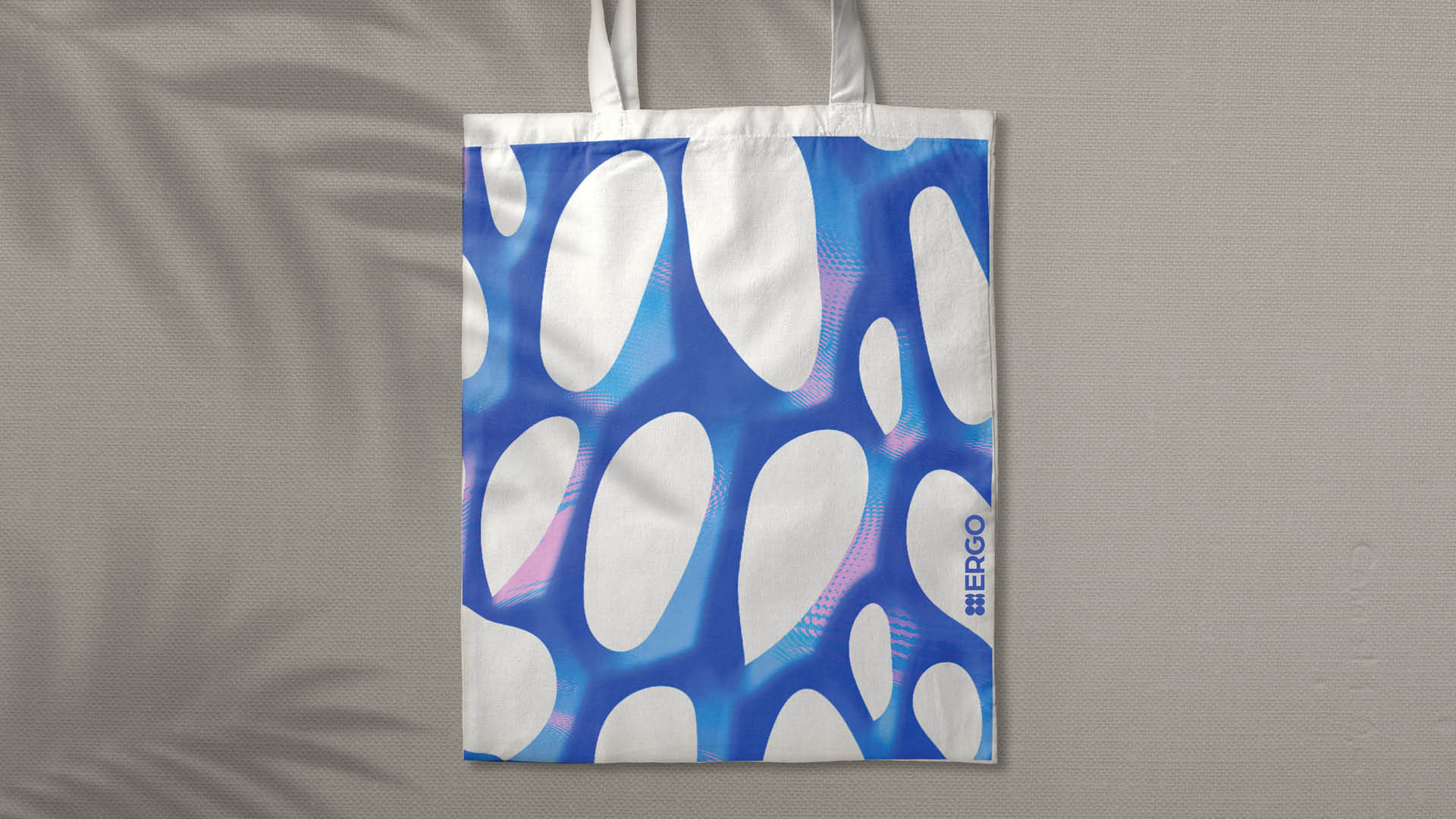
The logo uses simple geometric shapes to suggest depth within a flat form. Though static, its shifting composition creates a sense of movement and dimension, reflecting ideas of touch and material exploration translated into a visual identity.
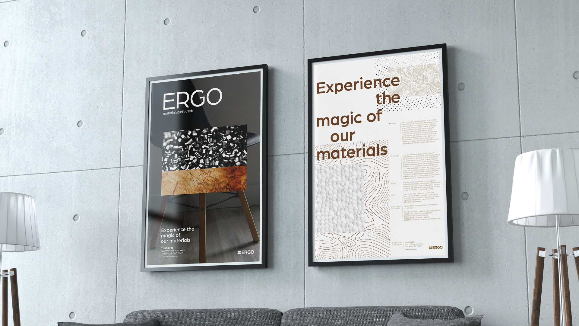
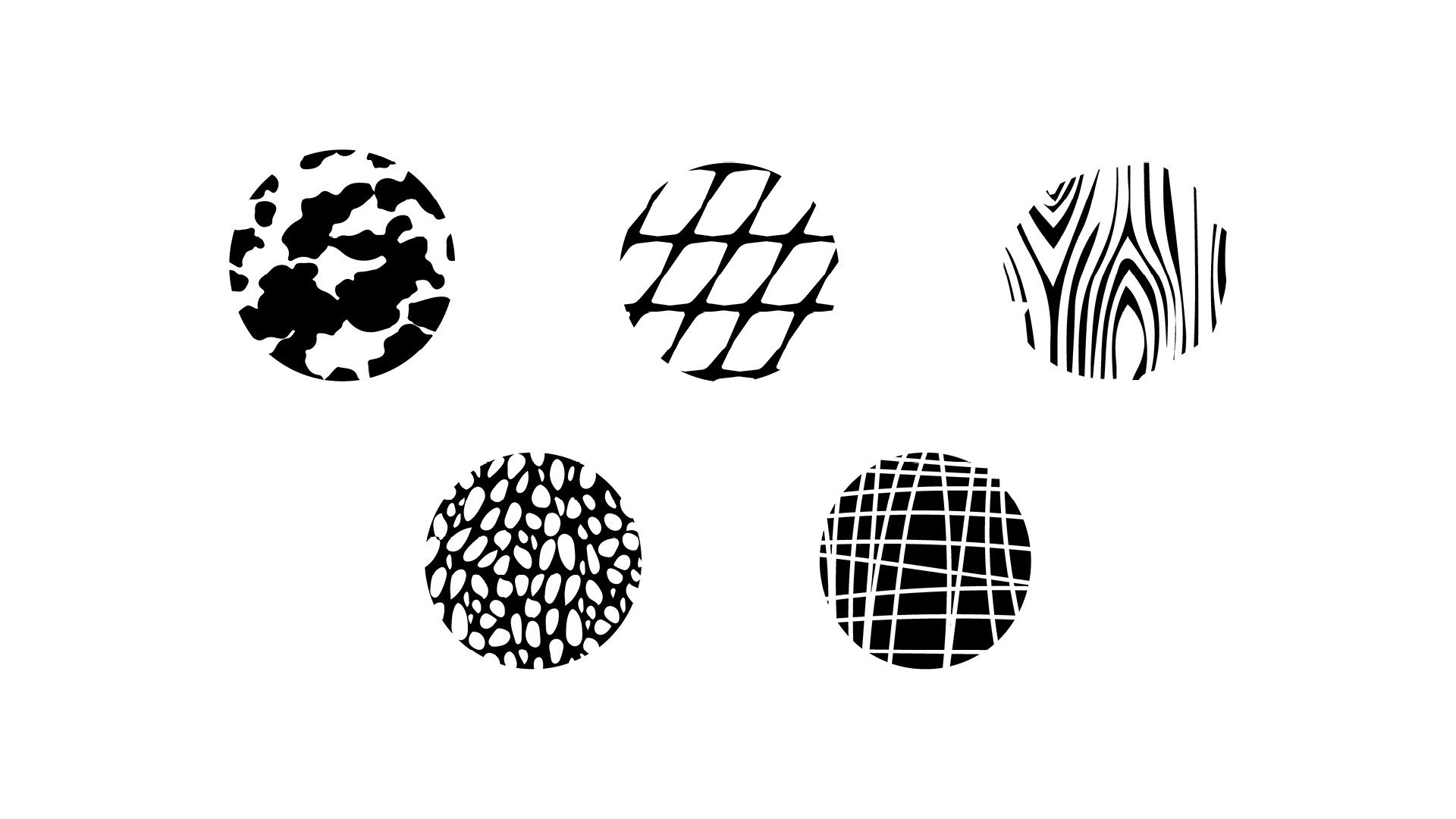
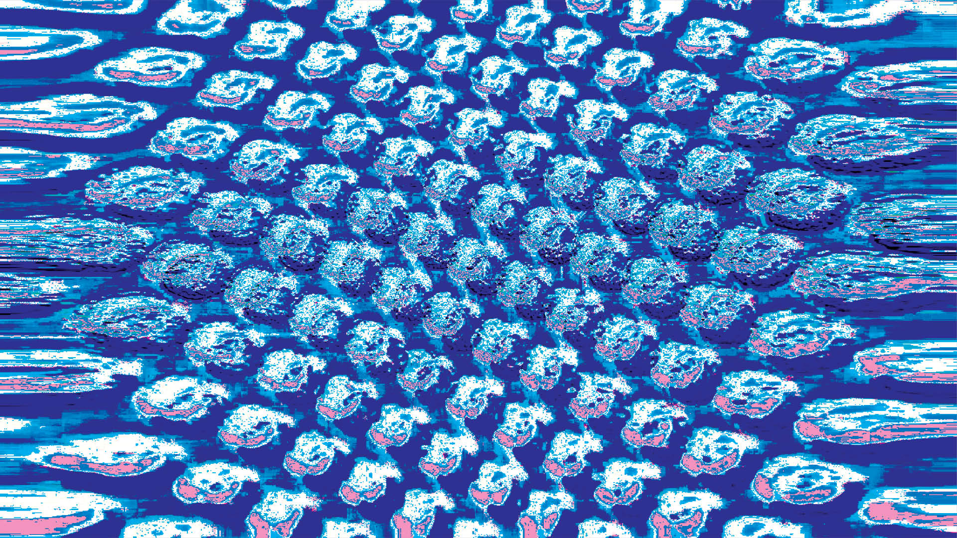
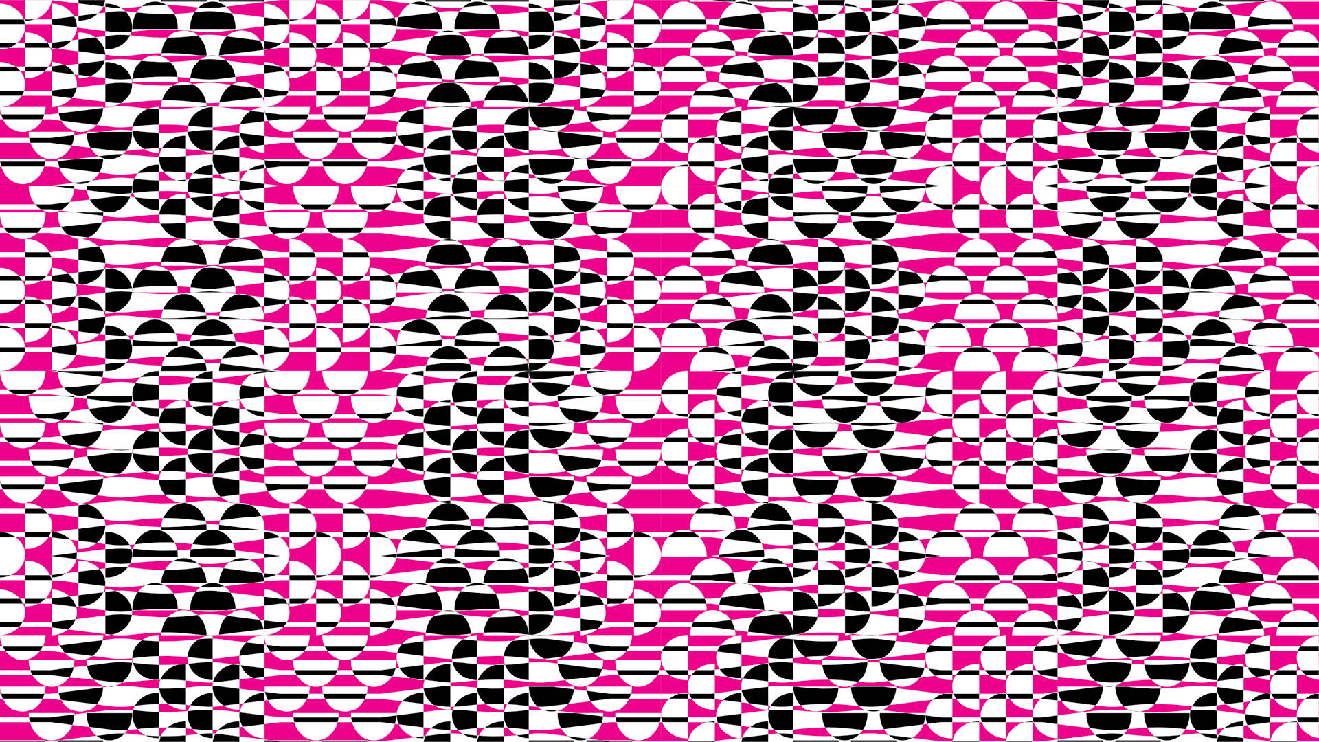
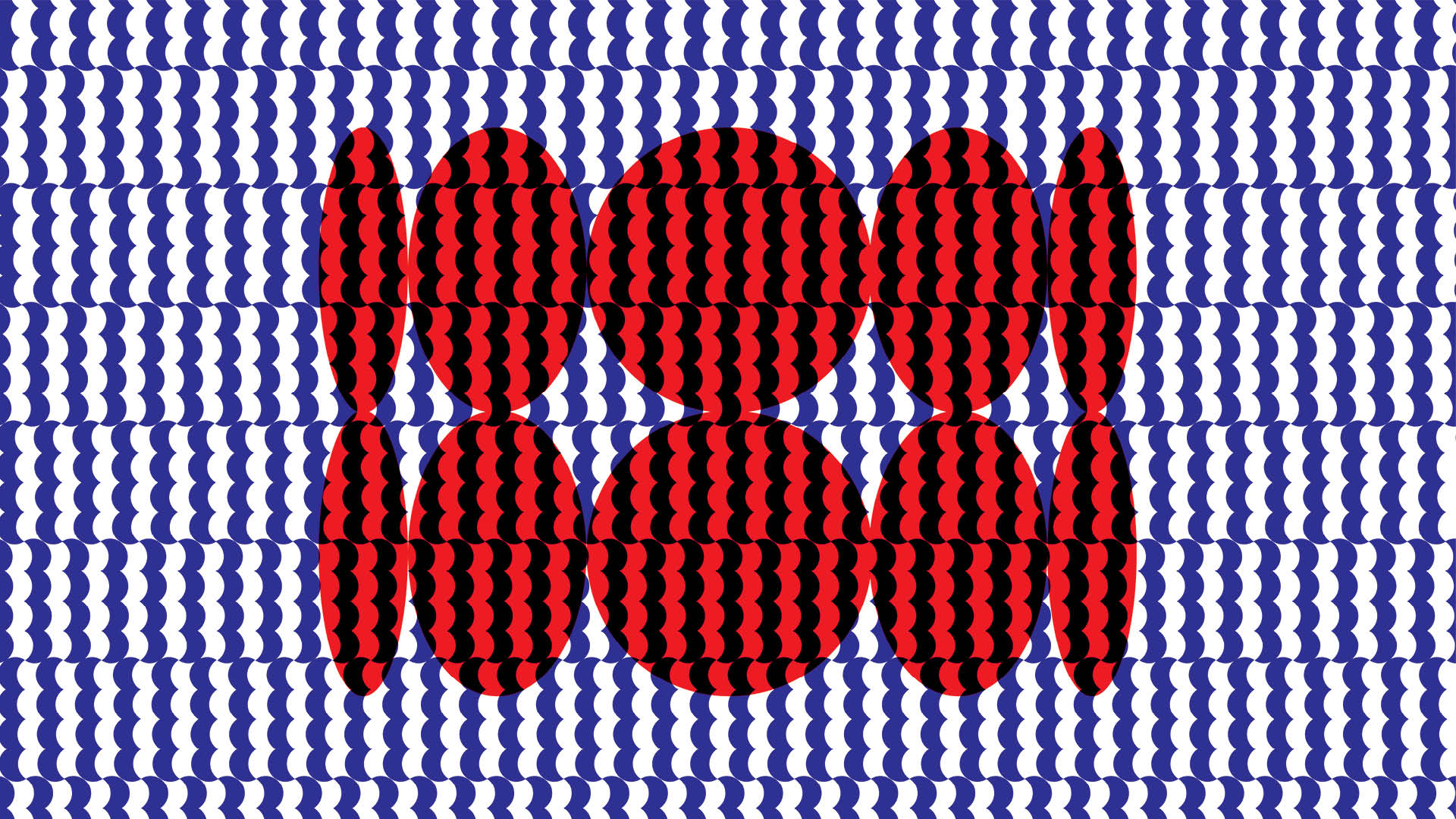
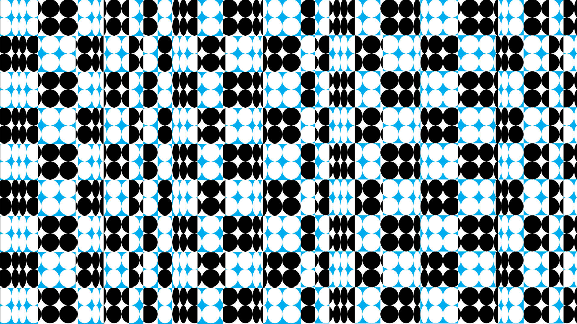
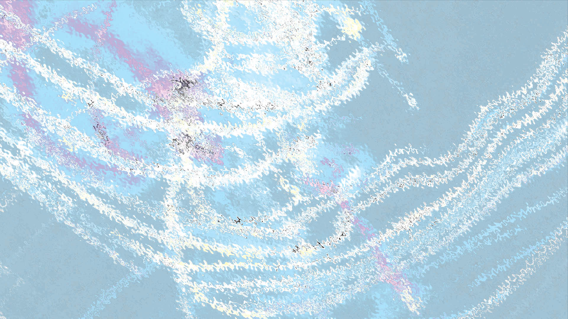
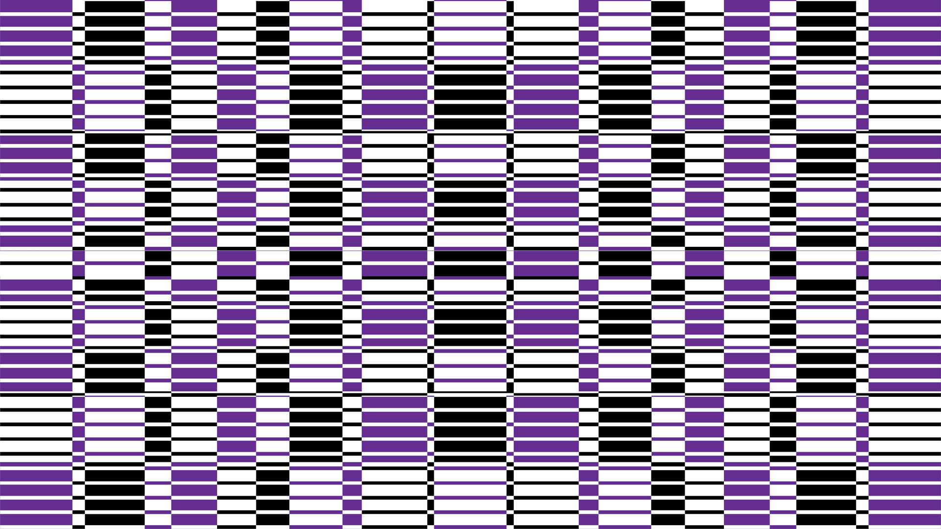
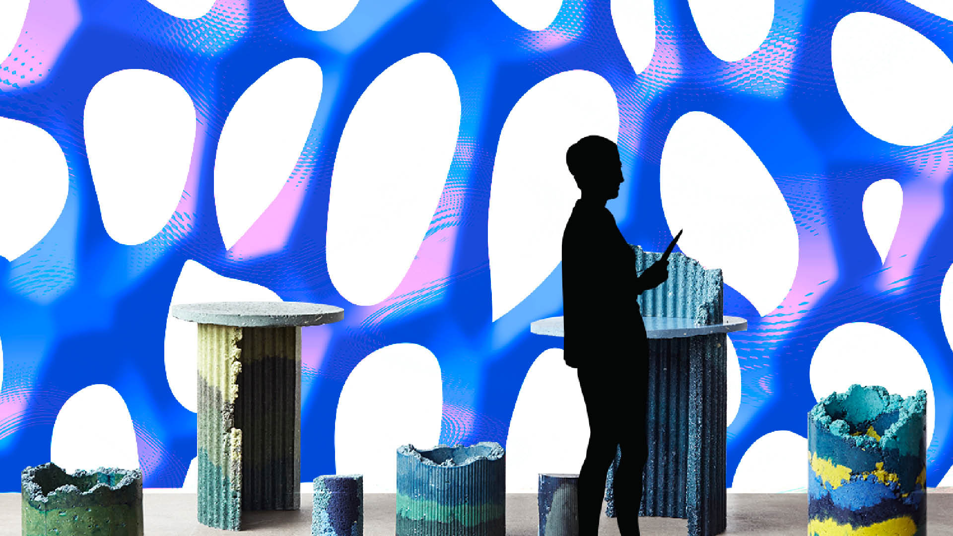
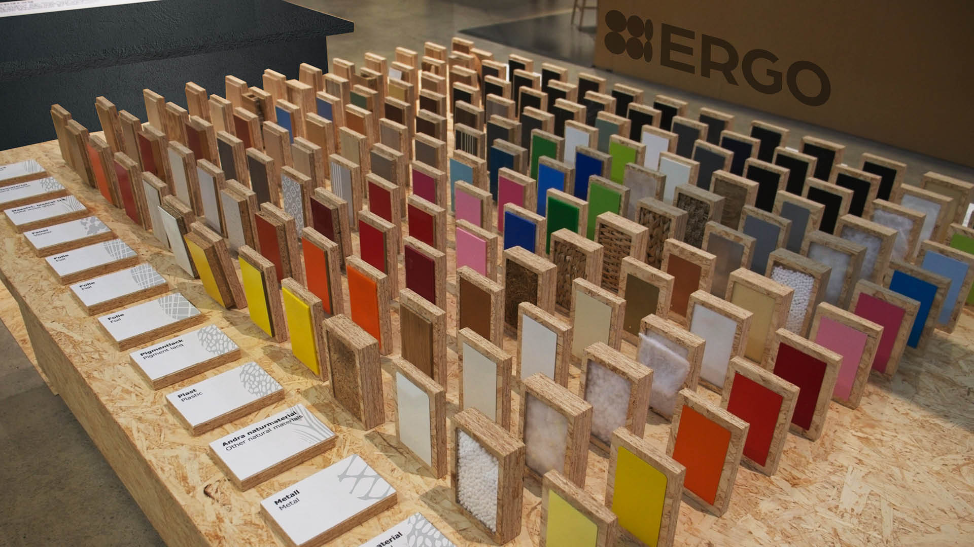
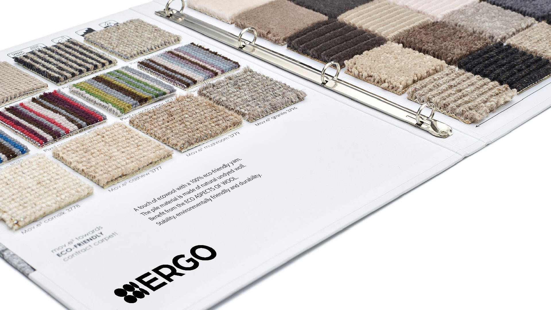
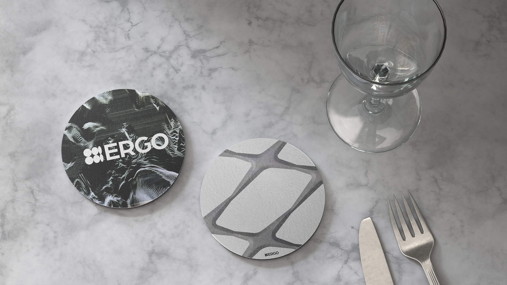
A series of icons represents the materials offered by ERGO, paired with patterns that express their distinct tactile qualities. The rectangles also act as the main visual elements, combined with material imagery and textures. It create layered rhythms that suggest different sensory experiences.
© 2026 Shengjie Wu. All Rights Reserved.