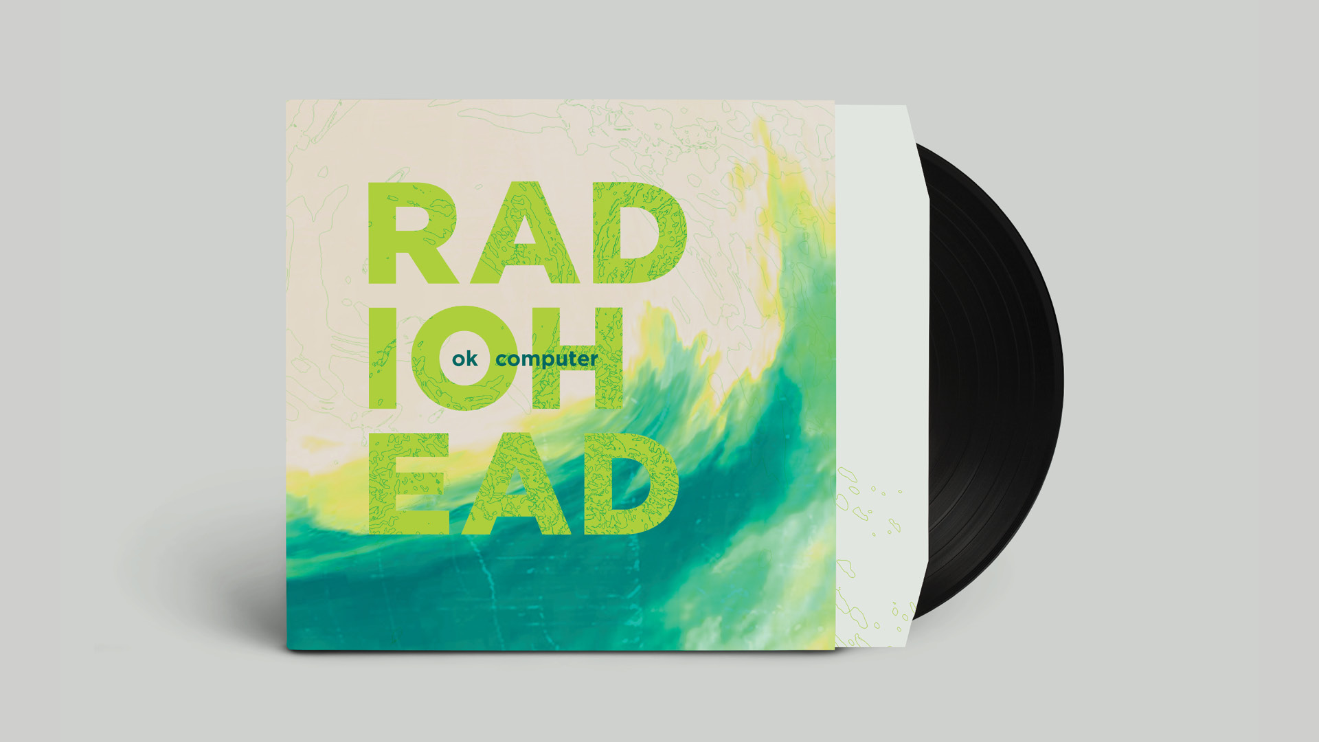
Isolation, alienation, anti-capitalism, and political corruption are key themes in Radiohead’s OK Computer, which anticipates aspects of the 21st century. Acid green is used to visualize emotional detachment and amplify the sense of unease within the work.
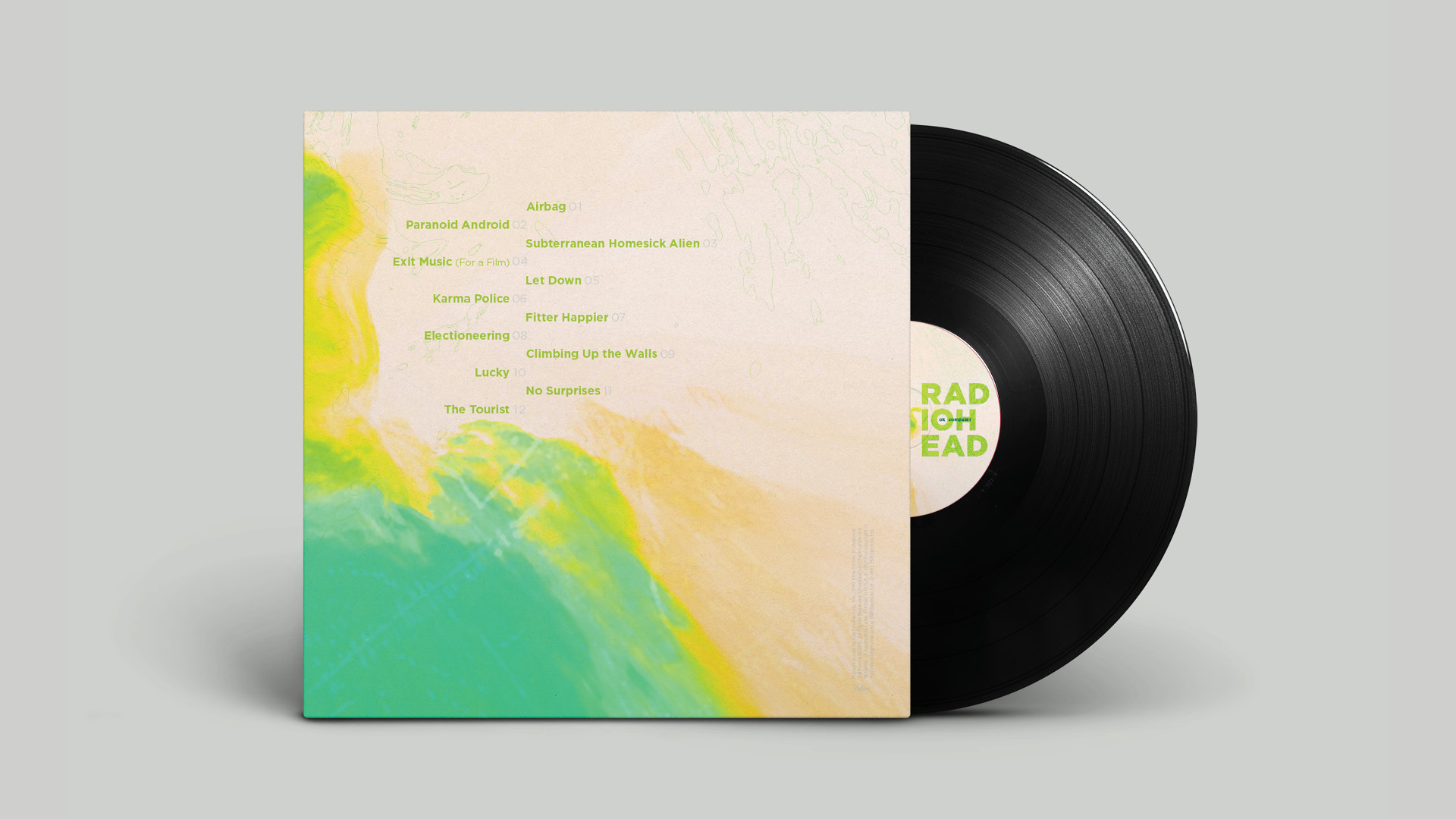
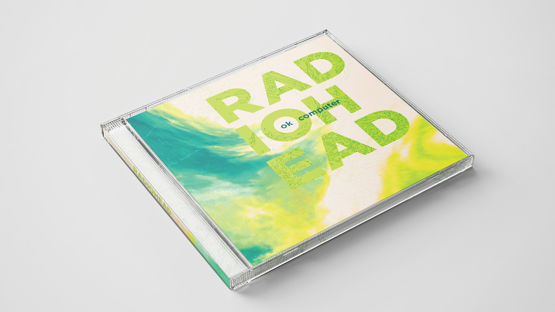
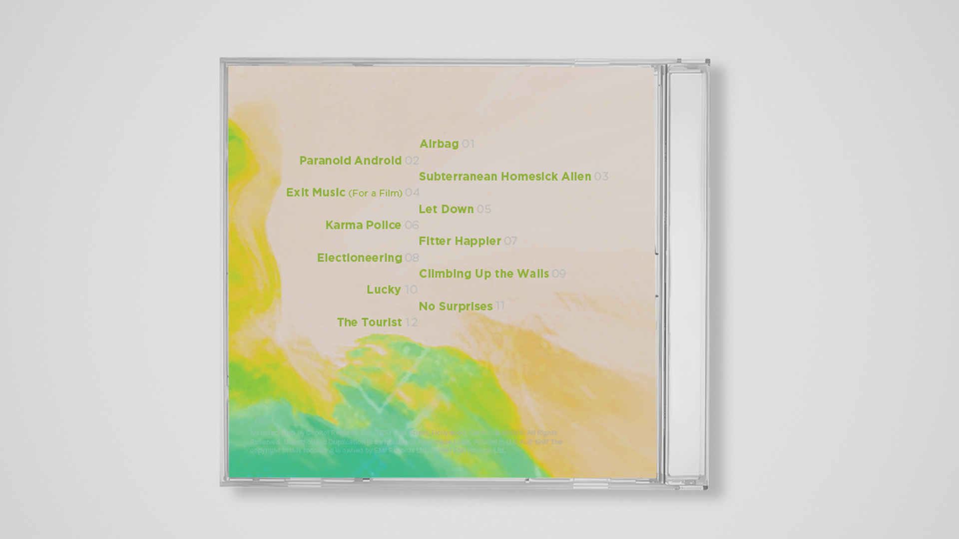
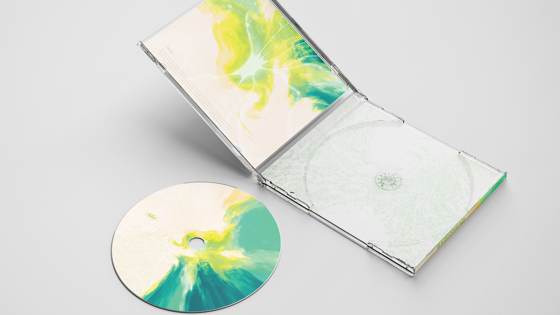
The CD design uses the same visual system as the LP. Because the CD contains a mini-book about the album introduction and song lyrics, layers of electronic texture are added to the CD graphic design to visually draw the audience into the content and atmosphere of the mini-book and music.







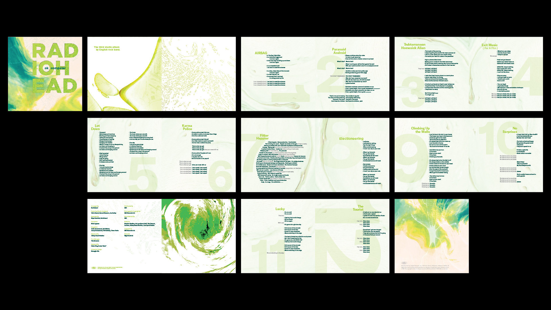
On the inside pages, the most emotional sentences are aligned to the right, while the rest are set to the left. A fluid texture from the cover is carried through, but in lighter tones to keep the text readable. Chapter 7 uses a different typographic approach, as its performance feels more like reading than listening, creating a distinct visual rhythm compared to the other songs.

Art Director: Shengjie Wu
Designer: Shengjie Wu
© 2026 Shengjie Wu. All Rights Reserved.
