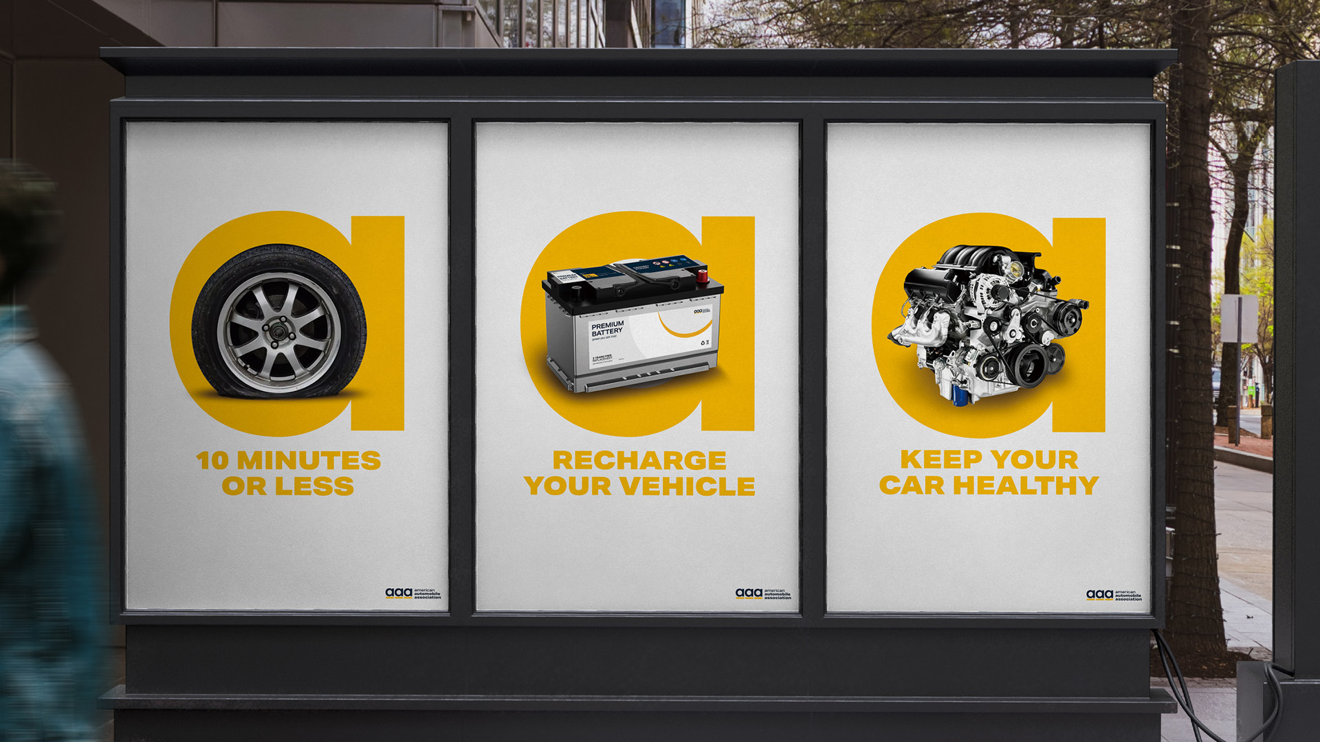

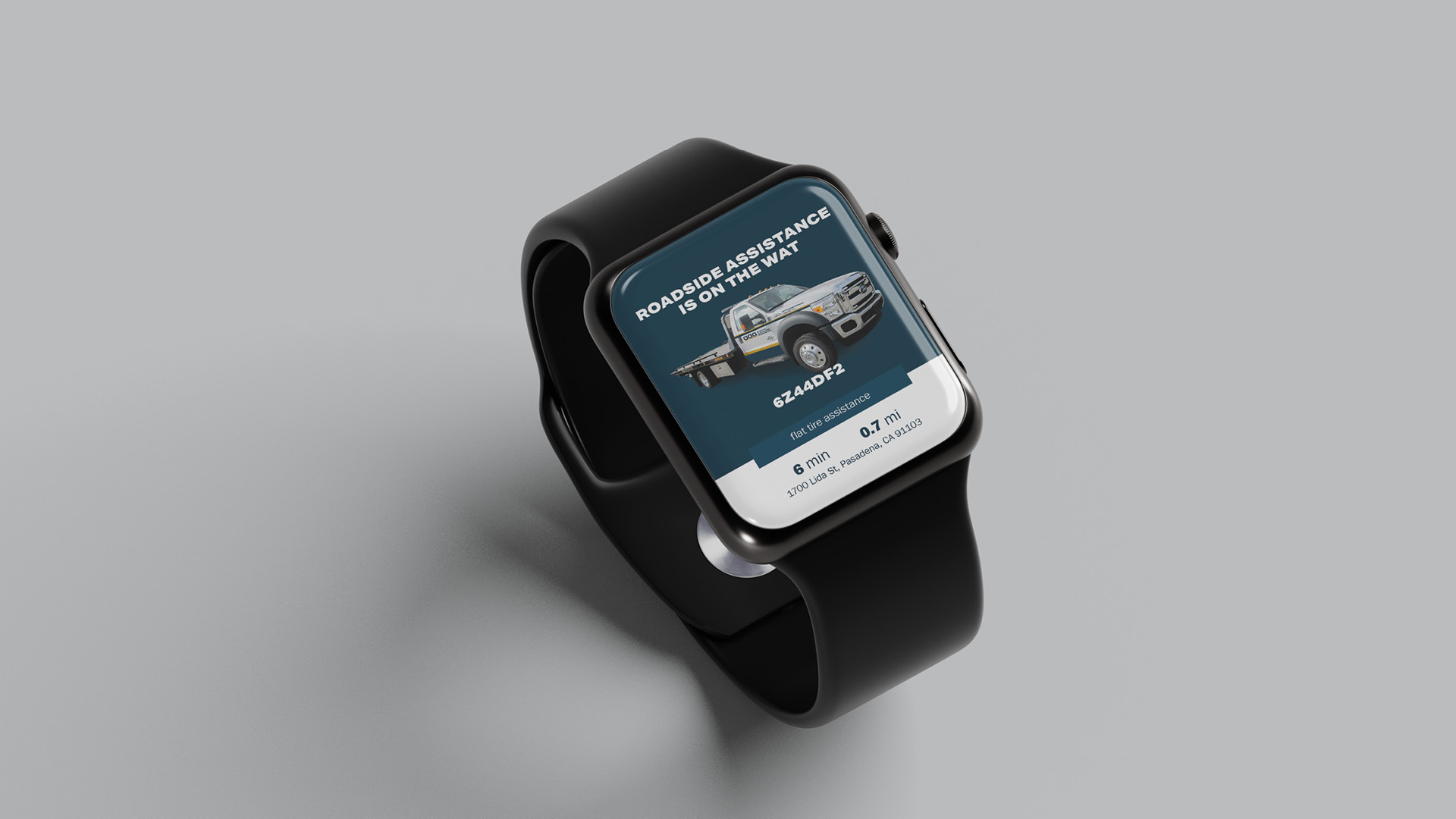
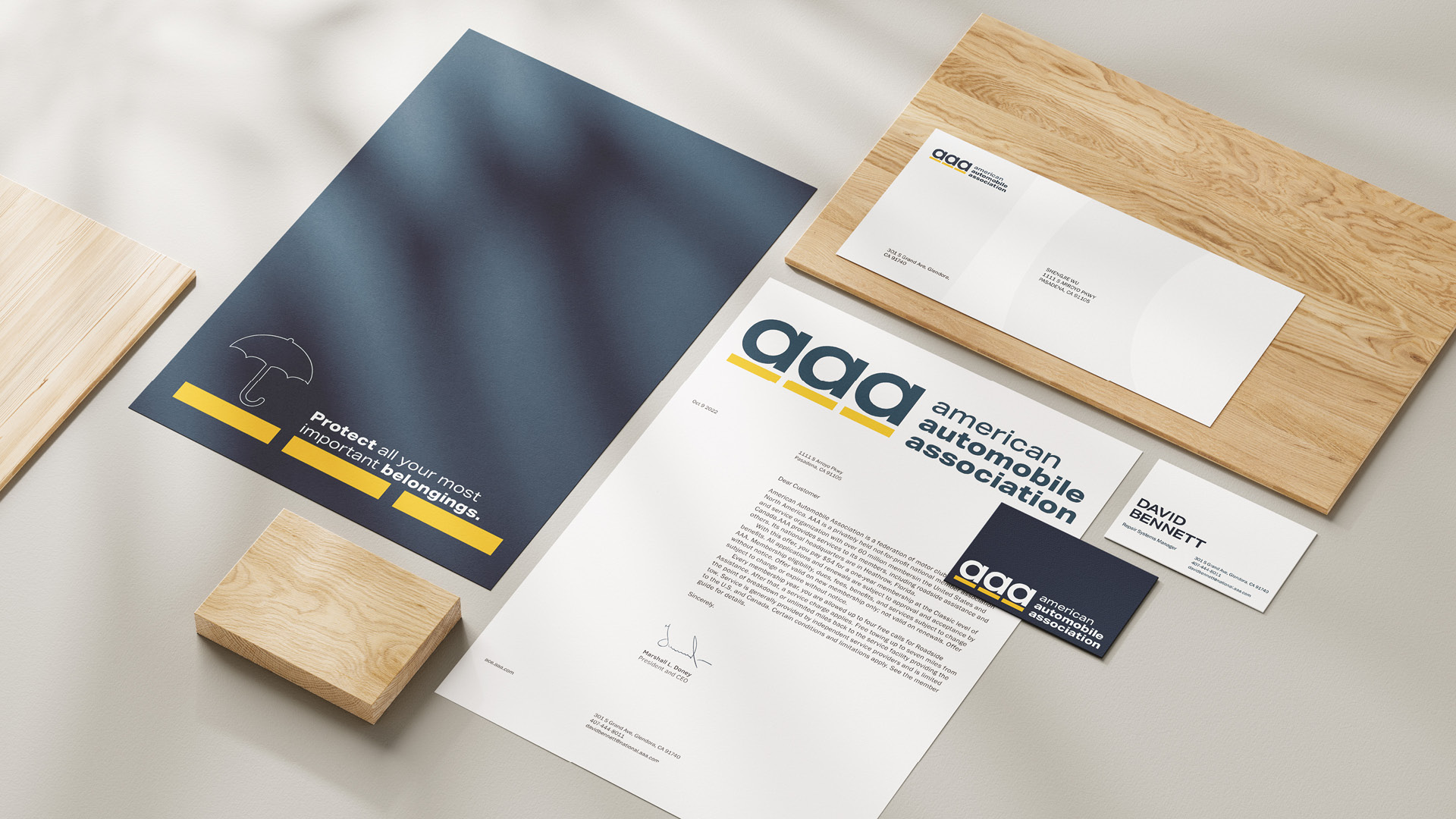
" The most recognized service offered by AAA is roadside assistance, which inspired the logotype’s road concept. The monogram of three lowercase “a” letters is designed to represent wheels; the yellow bar beneath them symbolizes the road. "
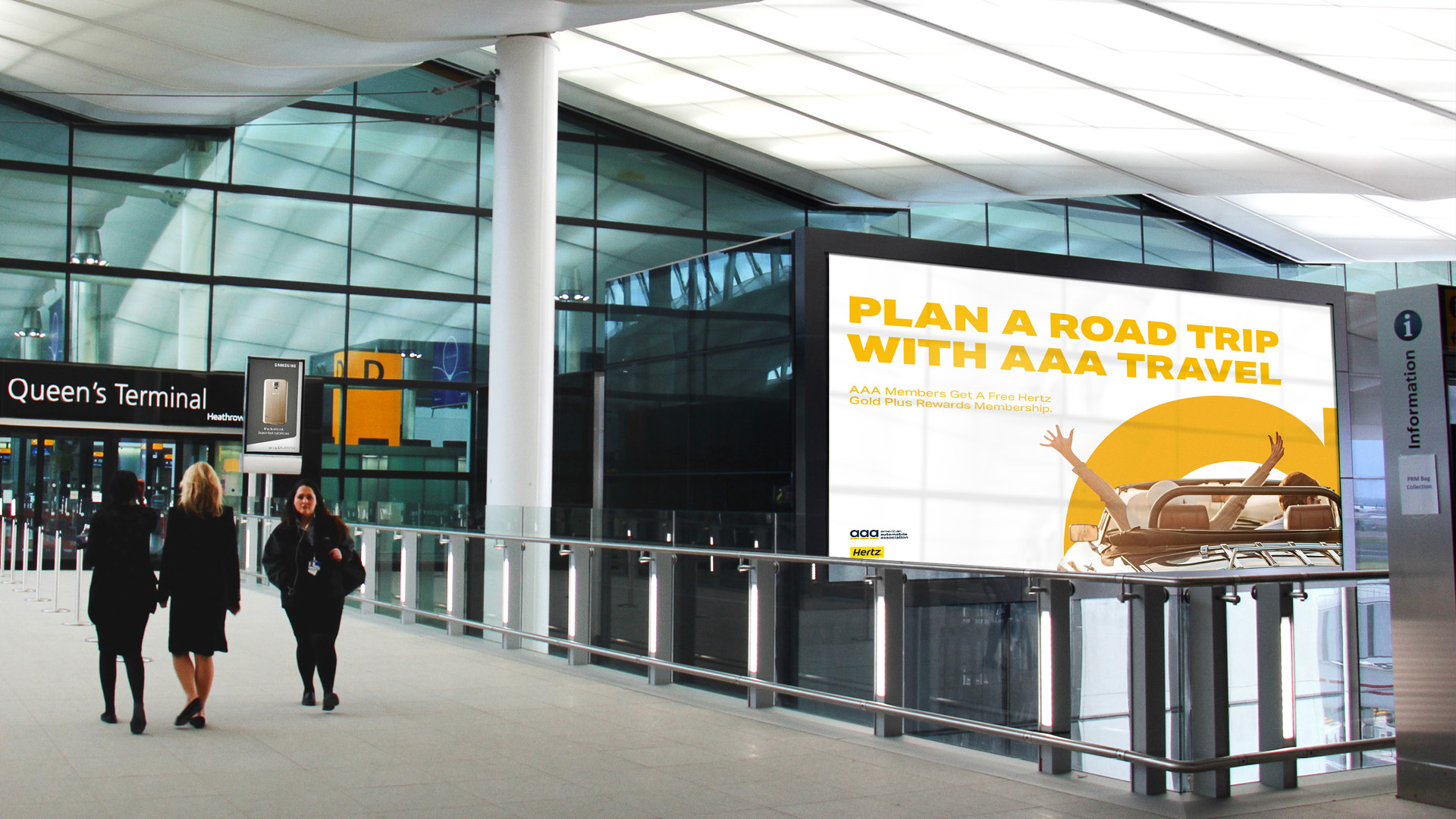
" The lowercase “a” serves as the core visual device, designed for both flexibility and conceptual depth. It serves as a framing element that suggests access, movement, and discovery, aligning with AAA’s travel and vehicle care offerings. "
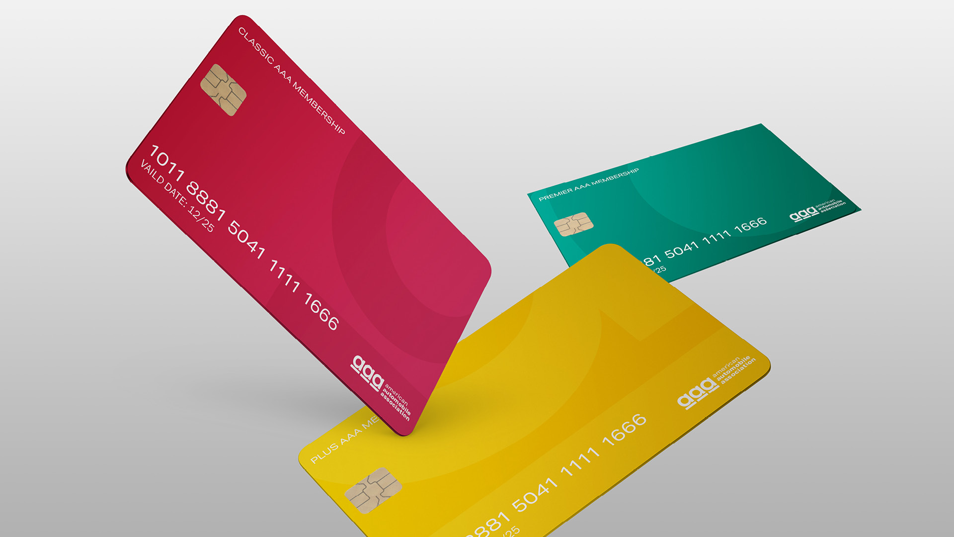
" The new AAA member card is inspired by the color system of traffic lights. Red, yellow, and green are used to distinguish different membership tiers, creating an intuitive hierarchy while reinforcing the brand’s connection to the road. "
© 2026 Shengjie Wu. All Rights Reserved.